

UX Design | UX Research | Front-End Development
GoodLife Fitness Redesign Project

Goodlife Fitness Centres Inc. is the largest health club company in Canada with over 450 locations across the country, under the banner of four brands.
After conducting user interviews, we discovered that many users preferred a quiet gym. However, there is currently no feature that supports this observation at this time.
TEAM
Cresabel De Guzman, UX Designer
Denis Liu, Lead Developer
Nancy Wong, UX Researcher
TIMELINE
6 weeks
PROGRAM USED

MY ROLE
Lead Designer

Backstory
Goodlife Fitness Centres Inc. is the largest health club company in Canada with over 450 locations across the country, under the banner of four brands. With the recent pandemic, members may feel hesitant to go in-person to high volume establishments, including gyms and fitness classes.
PROBLEM
The Goodlife Fitness website was designed to give information, sign up for group fitness classes and give customers access to their accounts. We have observed that our website doesn’t show the max capacity in fitness classes or track foot traffic in the facility, which is making for users to plan their gym visits.
“How might we help users track traffic capacity in real time?”
There is currently no way for users to determine volume at the gym without calling or going in-person.

SOLUTION
A redesign of the current website, with a new feature developed based on user behaviours.
We believe a food traffic feature will result in a better user experience and increase gym visits, longer workouts, and customer retention.

MY PROCESS
WEEK 1
WEEK 2
WEEK 3
WEEK 4
Define
Research
Design & Testing
Ideate
Scope
Problem Discovery
User Interviews
Persona
User flow
Wireframe
Style Guide
Testing
Overall Design
Iterations
DEFINE
Visual Analysis + Problem Discovery
Doing a visual website analysis of the current GoodLife website, we it’s UI is great. However, we can take this good website to great by improving the user experience.
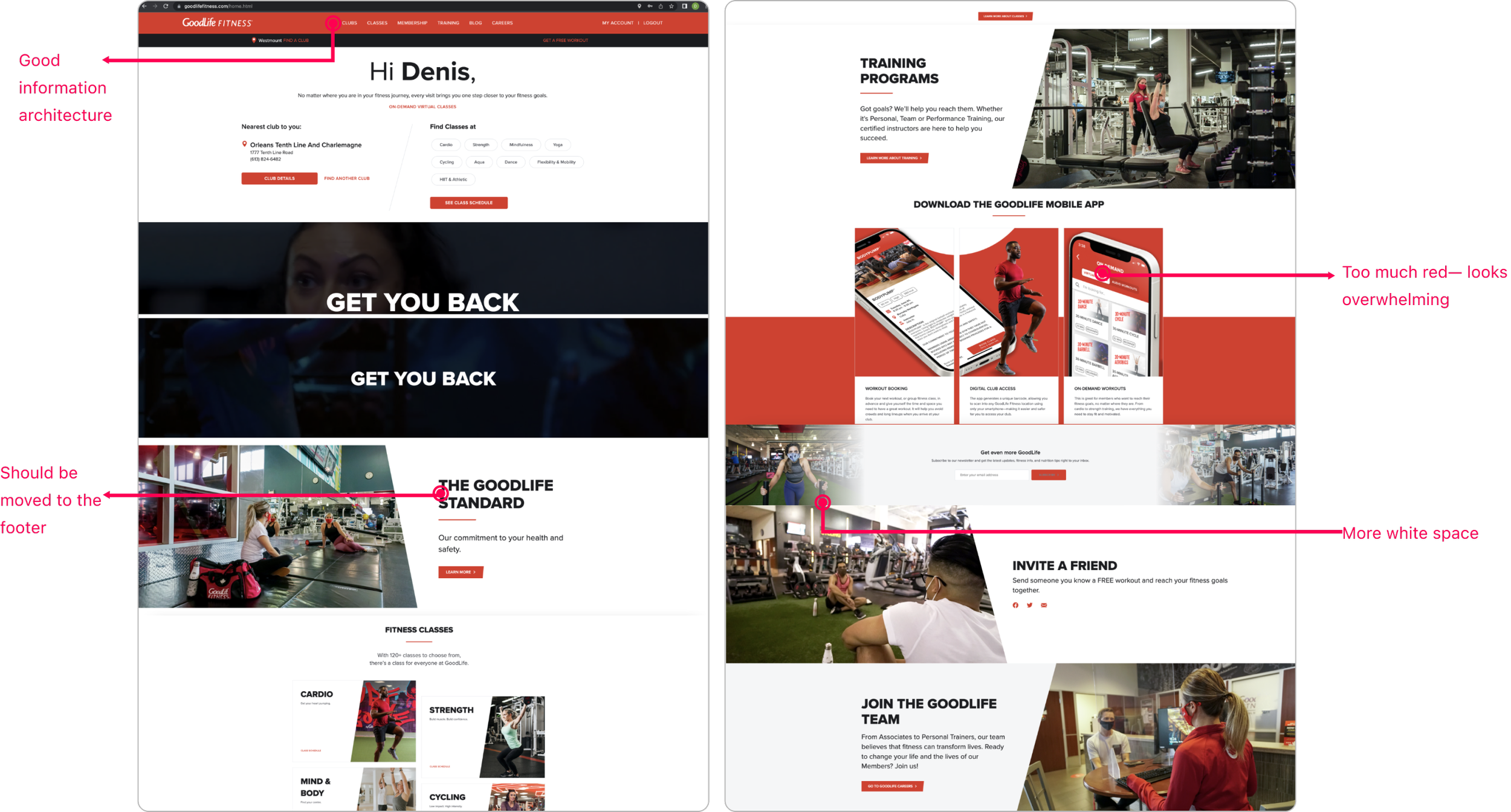
The current GoodLife Fitness website doesn’t look bad. But, we can do better.

RESEARCH
User Interviews
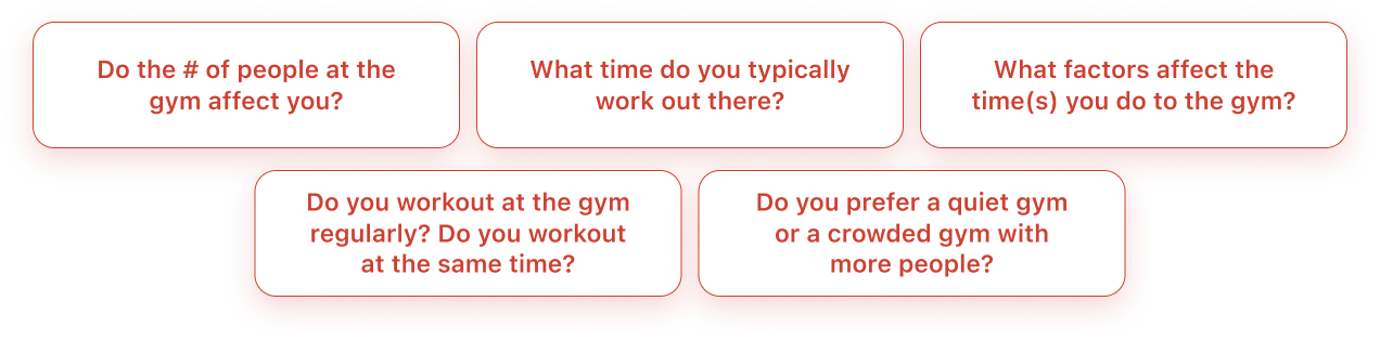
We conducted 8 semi-structured interviews with participants who actively attend the gym in order to uncover the pain points of the current website.
Below are some questions we asked our respondents.
RESEARCH
Research Findings
Here are the main results we discovered from our interviews.
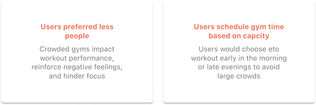
By conducting interviews, we were able to better define the goals of our project and have a better understanding of the current user experience.
RESEARCH
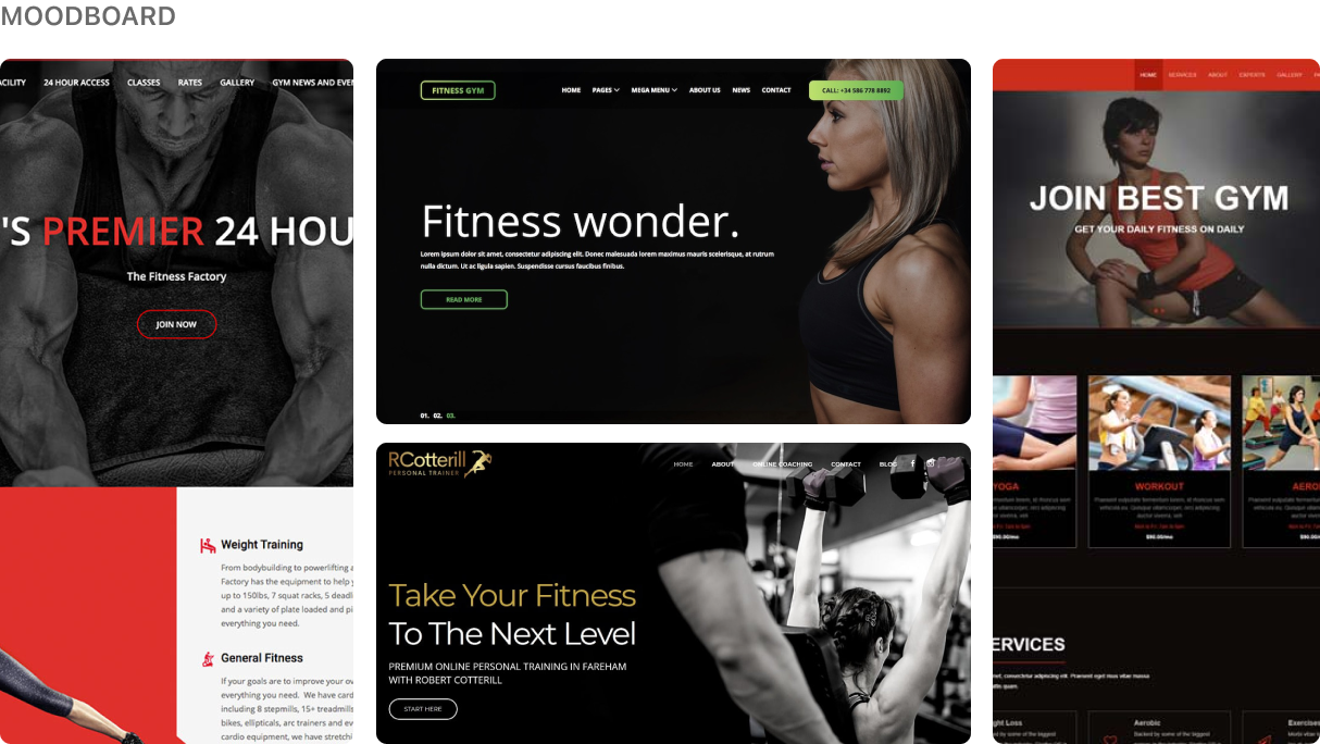
Competitor Analysis
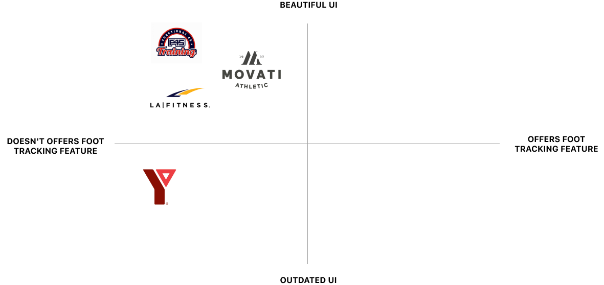
Since the fitness space is quite saturated, we wanted to explore what was currently in the market. We used a 2x2 matrix to map out solutions offered by our competitors compared to our idea. Since none of our competition offered a capacity-tracking feature, we knew our idea was unique to the market.
RESEARCH
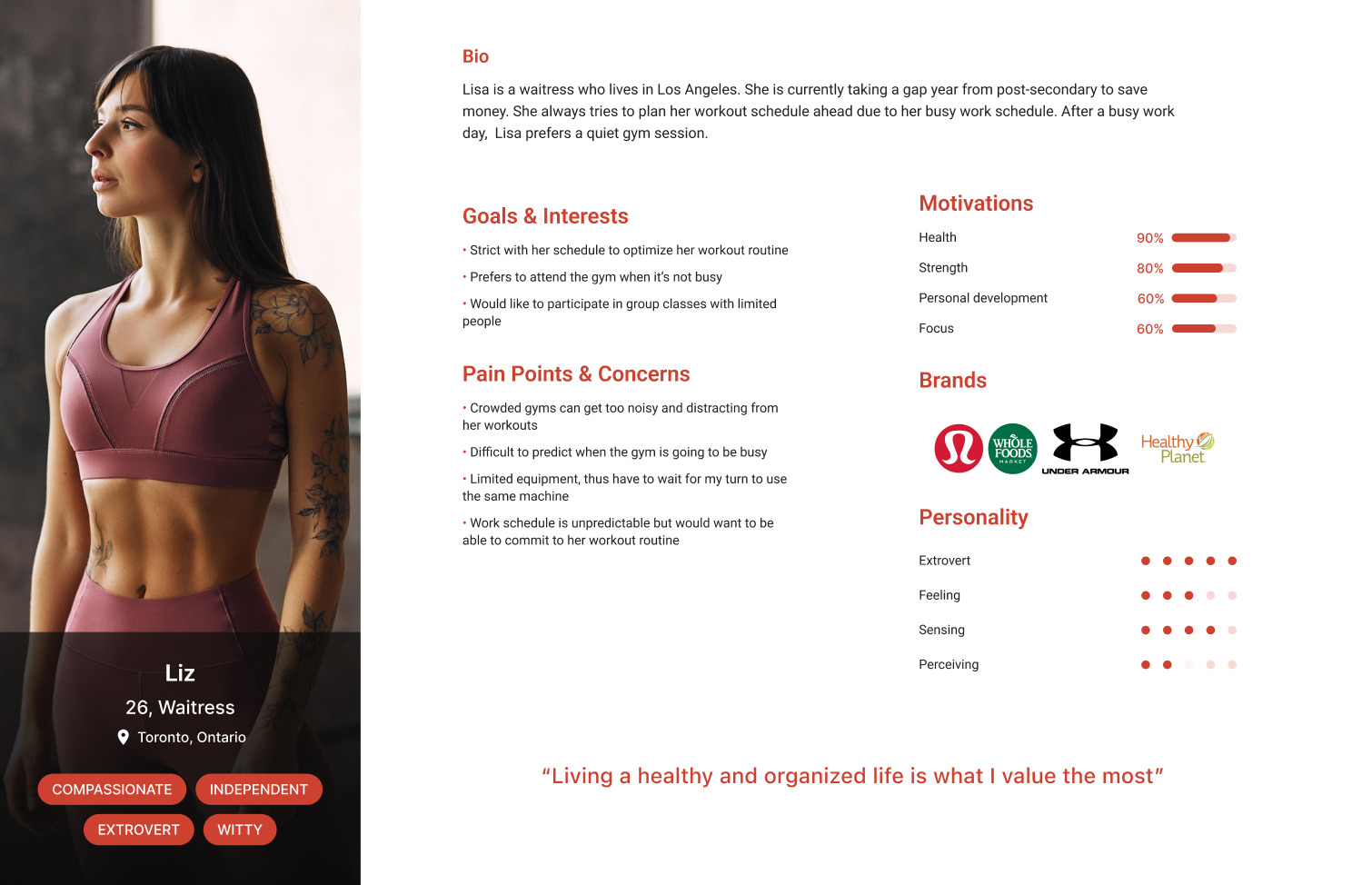
User Persona
After gathering insights from our user interviews, we used that data to create our user persona to help us empathize with our users.

RESEARCH
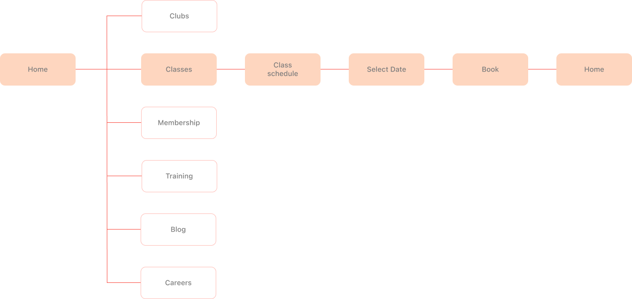
Userflow
Creating a user-flow chart helped us visualize the user’s journey to solve the navigation issue.
IDEATE
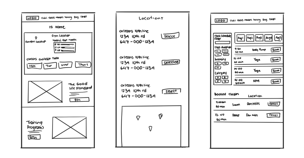
Lofi Wireframes
Following the user-flow as a guide, we created some wireframe on what our redesign could look like.
Desktop Screens for the Redesign

TESTING
User Testing + Results
Using our lofi prototype, we conduct guerilla user testing to ensure our user experience was on the right track. We had 5 user tests conducted. Here were the follow prompts:

1. Find the time when foot traffic is the lowest today
2. Find the maximum capacity for classes
3. Change the gym location
RESULTS
Having the feature in the top left was a great stop that all users found at ease. But, the it was ugly to look at it. Improvement will be made to the visuals.
Modernizing the homepage
Users didn’t know where to click afterwards.
Users had trouble finding max capacity
Gym location was in a spot that most other fitness website would have it. Using the location icon was also a great indicator.
Gym location was intuitive
IDEATE
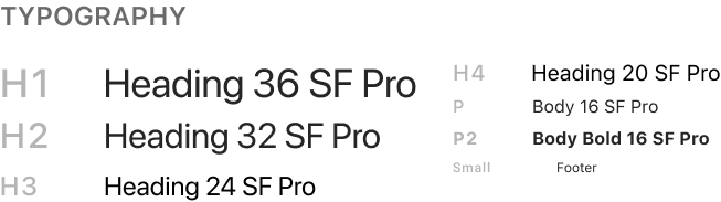
Style Guide + Design Systems
The look and feel is important to branding. We wanted to keep the new design clean, simple, and modern.


DESIGN
Overall Design Concept
As a team, we decided that there were 3 main points we wanted to target with our design.
We used familiar Icons (shoe) to indicate the capacity level
Simplify the foot traffic feature
Hints of red with mostly black gives it a more modern look
Less Red

It’s a digital age where everyone is on their whole. So making sure webpages are responsive should be the bare minimum.
Responsiveness
DESIGN
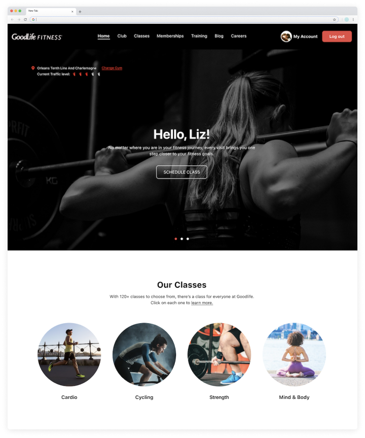
Major iterations
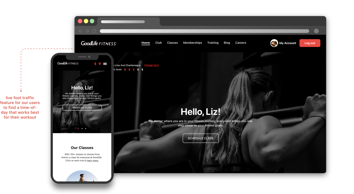
The homepage is the first page our users will land on our website. With that in mind, we spent a considerable amount on it. Here are all the iterations we’ve made. We ultimately decide to focus more on visuals > text.

Before (V1)

After (Final Mockup)
Homepage (Desktop)
Homepage (Desktop)

Before (V1)
Homepage (Mobile)
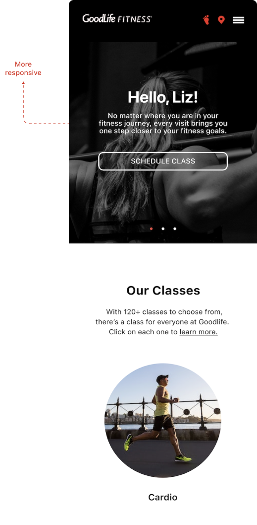
After (V1)
Homepage (Mobile)


REFLECTION
😩 CHALLENGES
It was difficult coming up with how the foot tracker should look like since this feature has not been done before. We look inspiration from google “popular time” as the closet feature.
💡 WHAT I LEARNT
User behaviours can change depending on societal condition. This is important to keep in mind when designing. What goes on outside the world impacts human behaviours.
⭐️ FUTURE DEVELOPMENT
The next steps would be to conduct user testing and get feedback. Since this feature has never been done before, it’s important to track responses from users and adjust accordingly.
Wanna see more projects 👀