

CRA Redesign Project
UX RESEARCH • SITEMAP • INFORMATION ARCHITECTURE

INTRODUCTION
The Canada Revenue Agency is the revenue service of the federal government and most provincial and territorial governments. The CRA collects taxes, administers tax law & policy, delivers benefit programs, and many more. Over time, our team noticed that users were getting frustrated because of poor navigation and extreme page depth. This redesign takes user’s current behaviours and provides a solution tailors towards it.
MY ROLE
User research, synthesize, product design, and style guide.
THE TEAM
3 designers, 1 researcher
TIMELINE
May 2022 - June 2022
BACKSTORY
The Canada Revenue Agency (CRA) is the revenue service of the Canadian federal government. They collect taxes, administer tax laws, and deliver benefits to Canadians. It’s the largest organization in the Canadian federal public service, employing ~44,000 individuals and an operating budget of $5.1 billion.
Despite its high recognition, the CRA is notorious for its frustrating tax filing process consisting of excessive pages of repetitive content.

PROBLEM STATEMENT
The CRA website was designed to allow users to streamline the tax filing process from the comforts of their homes. We have observed the CRA website’s poor navigation results in frustration leading to a high call volume traffic to call centers to get assistance. How might improve the CRA website so that users are able to do what they want positive user experience and return visits to the website?
SOLUTION
A redesign of the current website, with a new feature, was developed based on user behaviors. We believe a personalized tax form will result in a better user experience and a decrease in call center traffic.
DEFINE
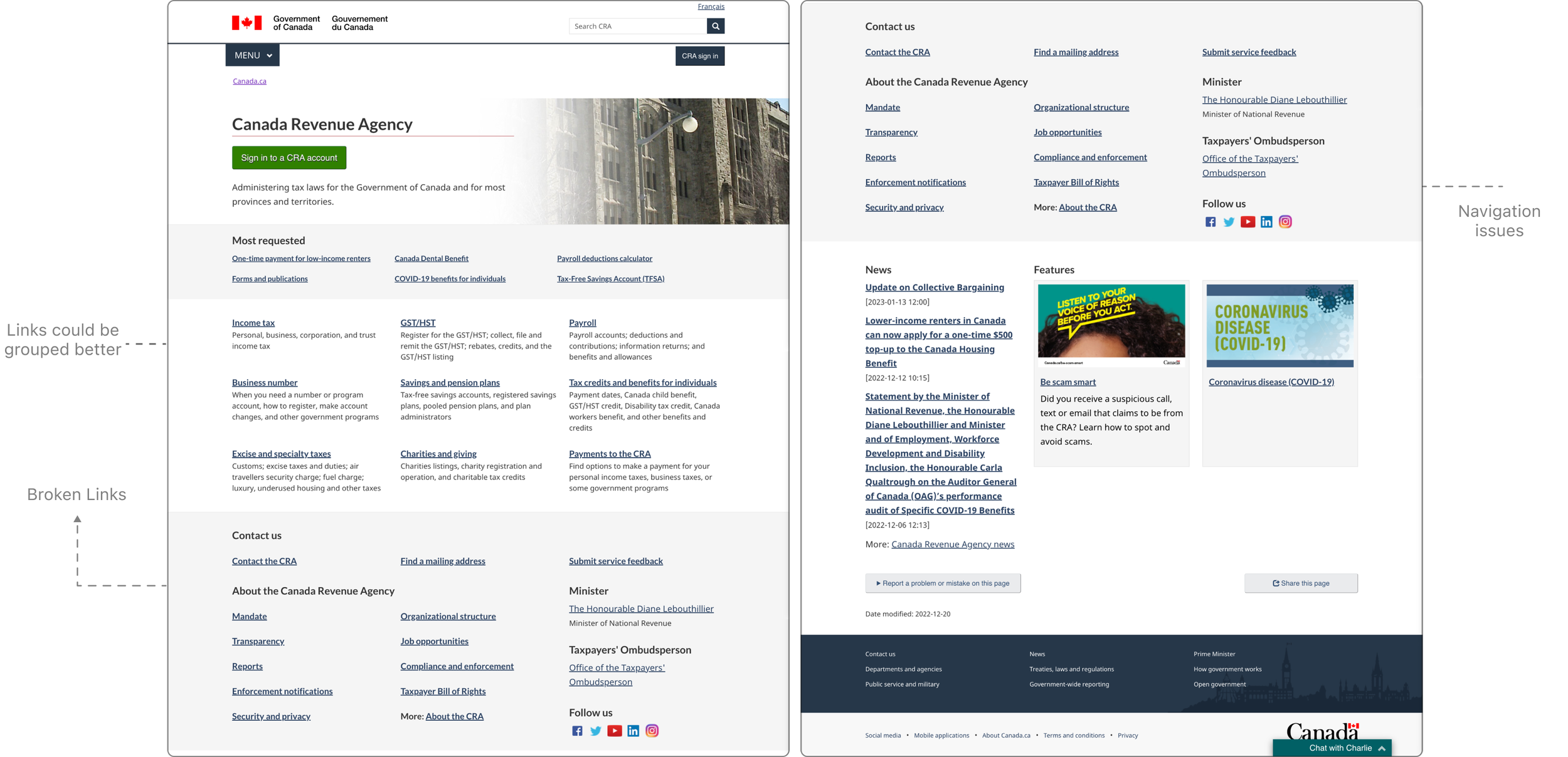
We conducted a usability test among our team and discovered that the website's information architecture is confusing. Although there is a lot of information, it is not organized in a way that makes it easy to navigate
Our team members had difficulty locating the income tax document, which is just one of the many tasks we attempted to complete. Many team members who were not familiar with the CRA website had to repeatedly use the back button, indicating poor user experience.
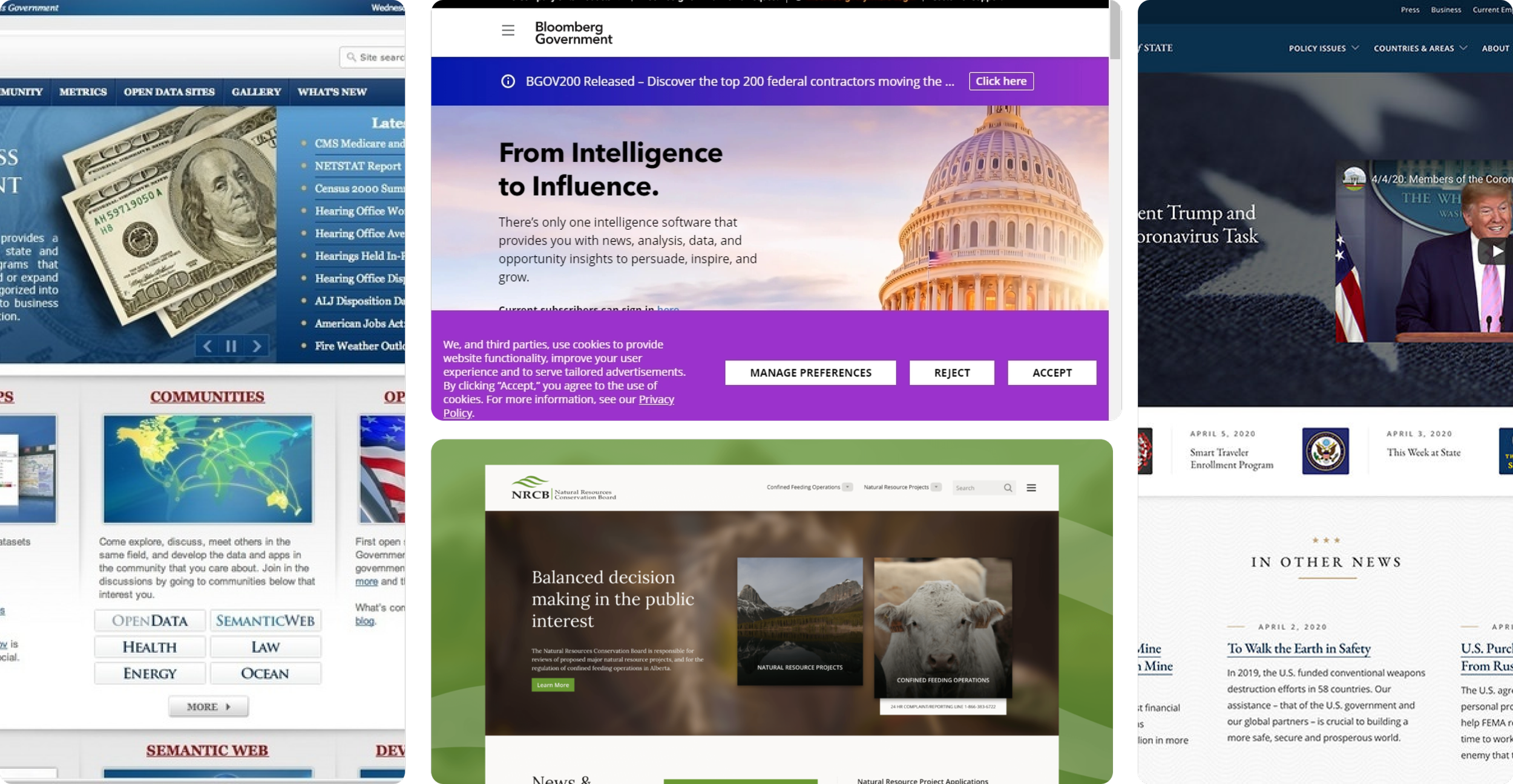
The project kickoff started with a visual analysis of the current website.
KEY TAKE AWAYS
PRELIMINARY USER RESEARCH
My objective is to uncover the motivations, pain points, and overall goals of individuals who have experience using with the CRA.
Additionally, I hope to gain insight into common themes relating to the problem space so have a better sense of direction on where to go next.
Let’s dive into research.
KEY TAKE AWAYS

EMERGING THEME FROM RESEARCH
🪜 Too many Steps
It takes 6 steps from the main CRA page to the personal income tax page.
🏛 Info Overload
Users will get overwhelmed by the amount of info at once. Where to click on next can be confusing because it’s not obvious.
PRELIMINARY USER RESEARCH
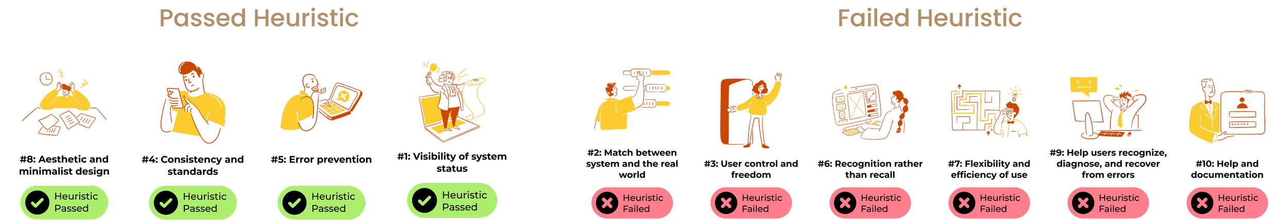
Using Nielsen and Molich's 10 User Interface Design Heuristics rules, we conducted a heuristics evaluation of the current CRA website to rate the usability of the sit
We have found it was passed on certain criteria, but failed others.
Define the problem using Redlined Heuristics Evaluation
PRELIMINARY USER RESEARCH
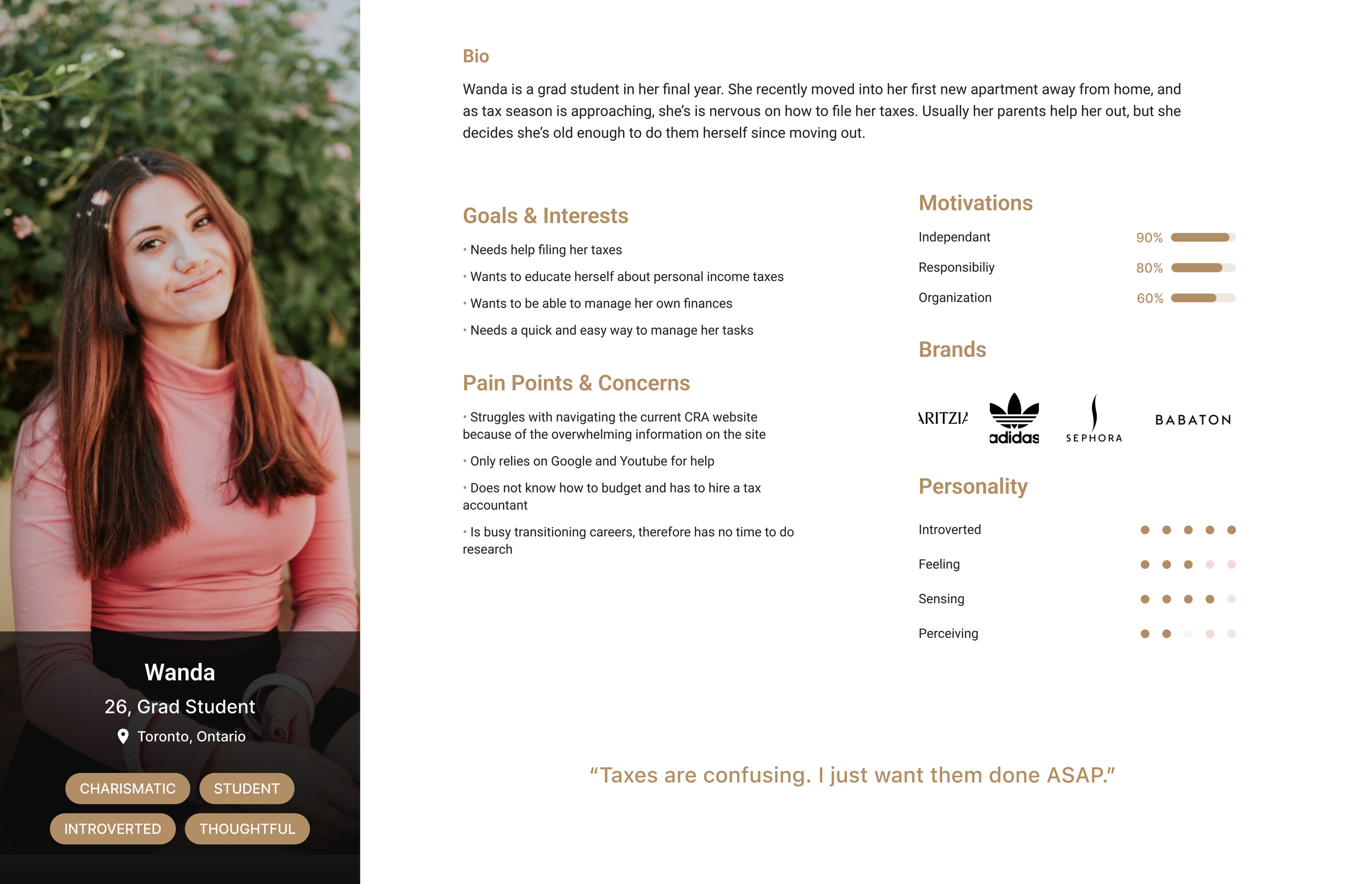
To help us gain an even better understanding of our users, we created a persona.
PRELIMINARY USER RESEARCH
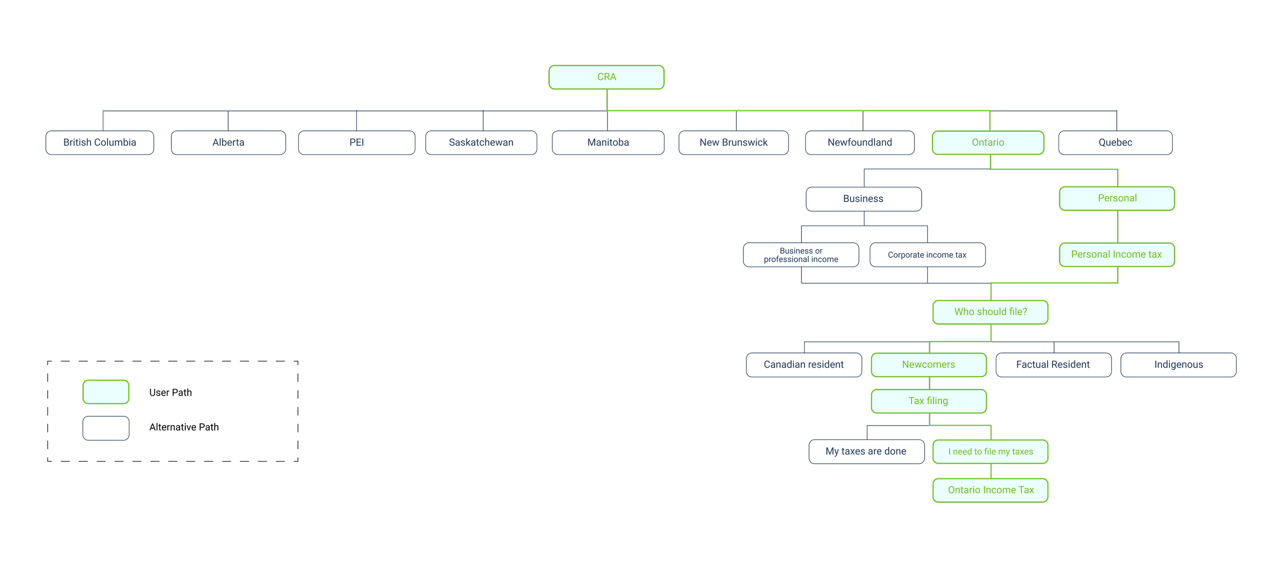
Conducting a site map gave us a visual of how information was currently laid out. We noted that the user path from the homepage to income tax took too many clicks. From online research, a website should avoid extreme page depth because it risks confusing its audience. The CRA’s tax filing process takes its user 9 clicks from the homepage to the income tax page. That’s way too many!
CONCEPT SKETCHES
The purpose of having a lo-fi prototype was to start testing ASAP to identify any issues with the primary flow. However, with the time constants, we moved on to mid & hi-fi prototype.
Using the user-flow as a guide, I created wireframes on potential designs

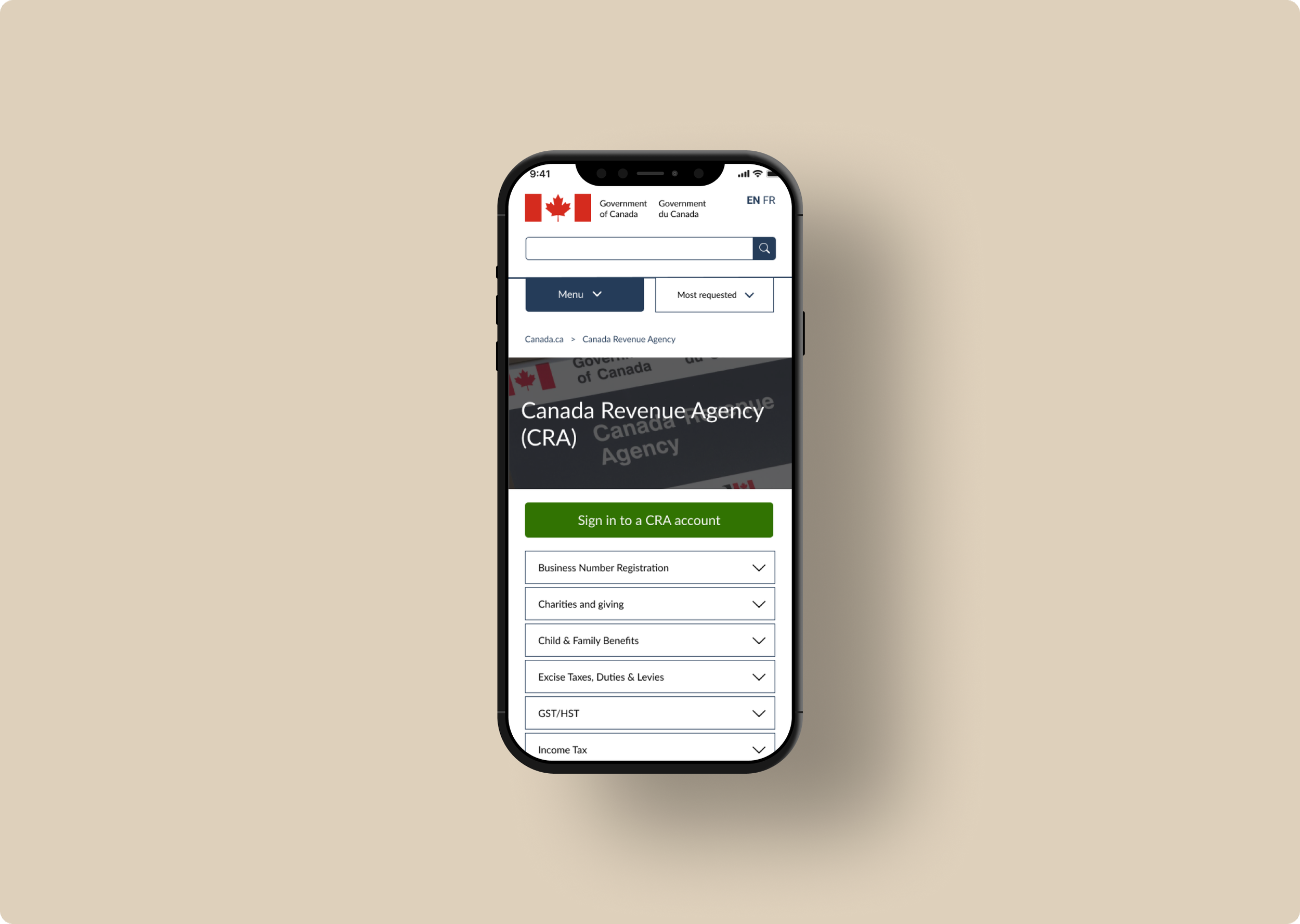
Mobile screens for CRA redesign
VISUAL IDENTITY
The Canadian government website is one of the most recognizable websites for Canadians. Therefore, we utilized their style guide as a reference for this redesign to maintain consistency with existing web pages and achieve a professional and credible appearance.
The look and feel are important to branding. We wanted to keep the design true to the Canada.com website.
To get some inspiration, I put together a mood board
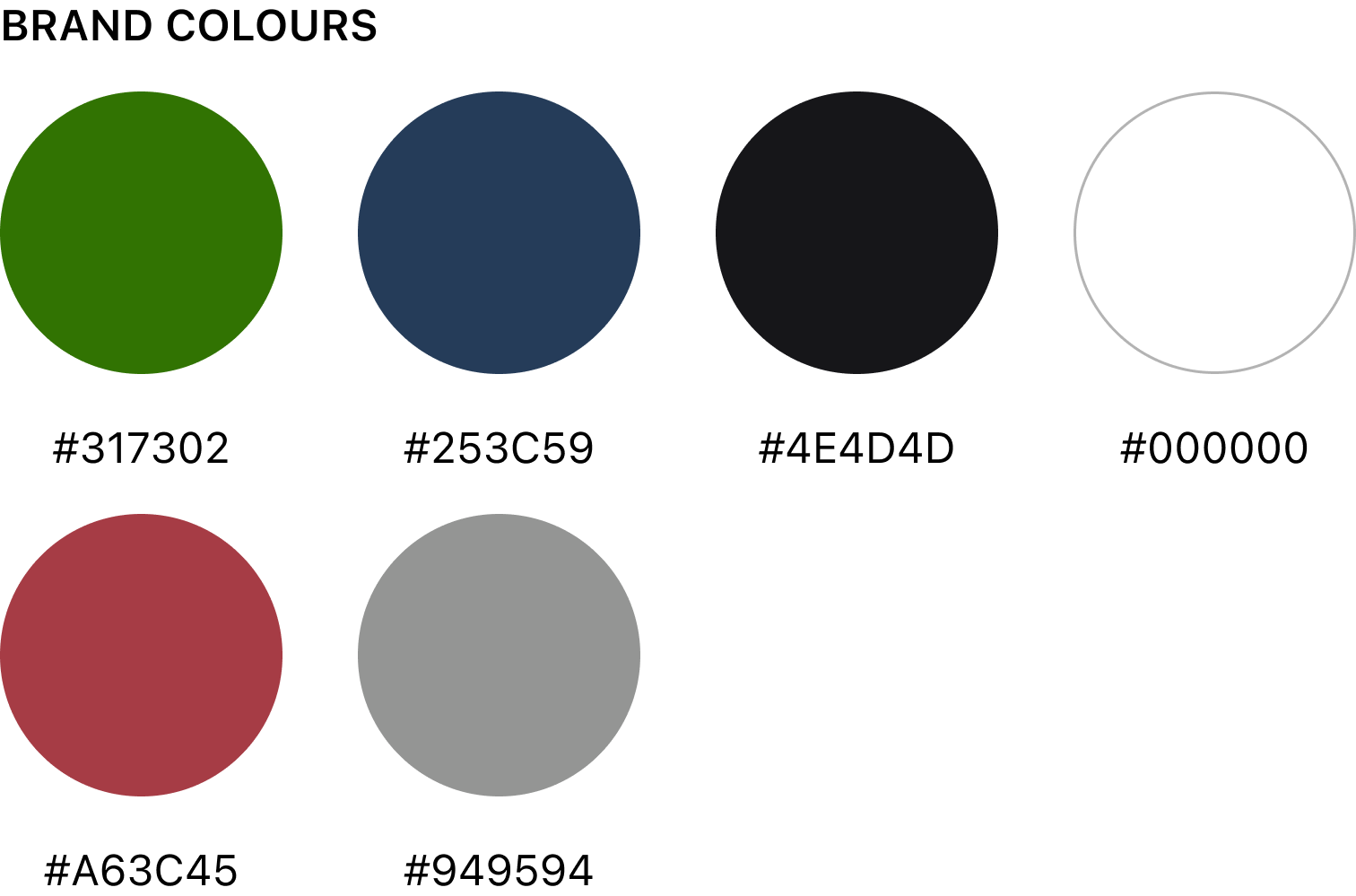
COLOUR & TYPOGRAPHY
Color invokes certain moods and emotions, so choosing the right colors is important to any brand identity.
Using a style guide keeps components consistent and professional.
I kept the same CRA colors because they are familiar to the users. I didn’t think it was necessary to change the original color palette.
As for typography, I used Helvetica Neue for a clean look and feel. I wanted the users to read the content with ease.

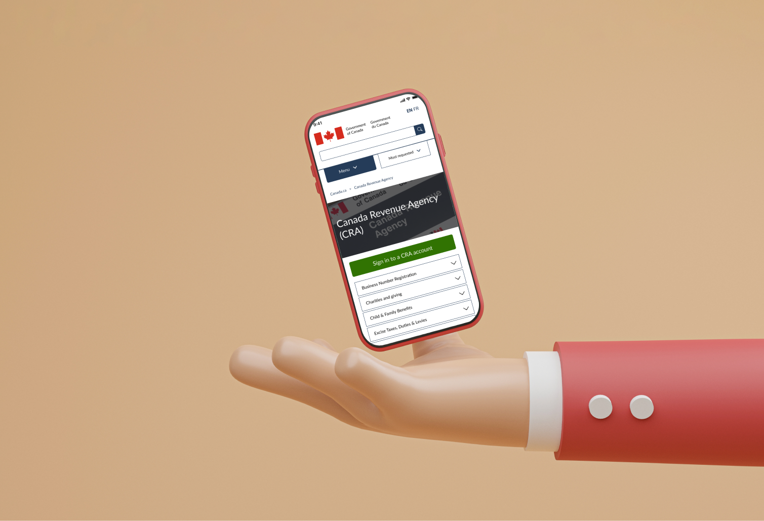
FINAL DESIGN
As we were short on time we decided to quickly move to the final stage of designing- hi-fi prototyping.
Using our lo-fi sketches as a guide, we created a clickable prototype for both web and mobile. The following are some highlights.

HIGHLIGHTS
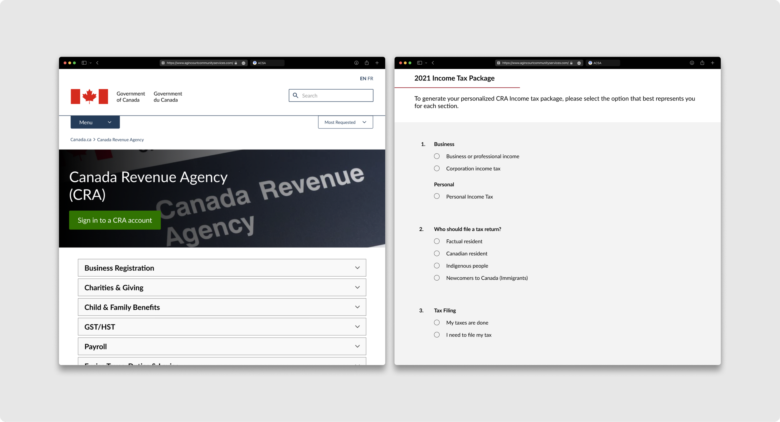
We decide to implement a form that can generate a personal income tax form. Users will check off the criteria that they meet, generating an income tax form for them to download. This will avoid the many layers of pagination, making the developer’s and the user’s life much easier.
Reducing the extreme page depth
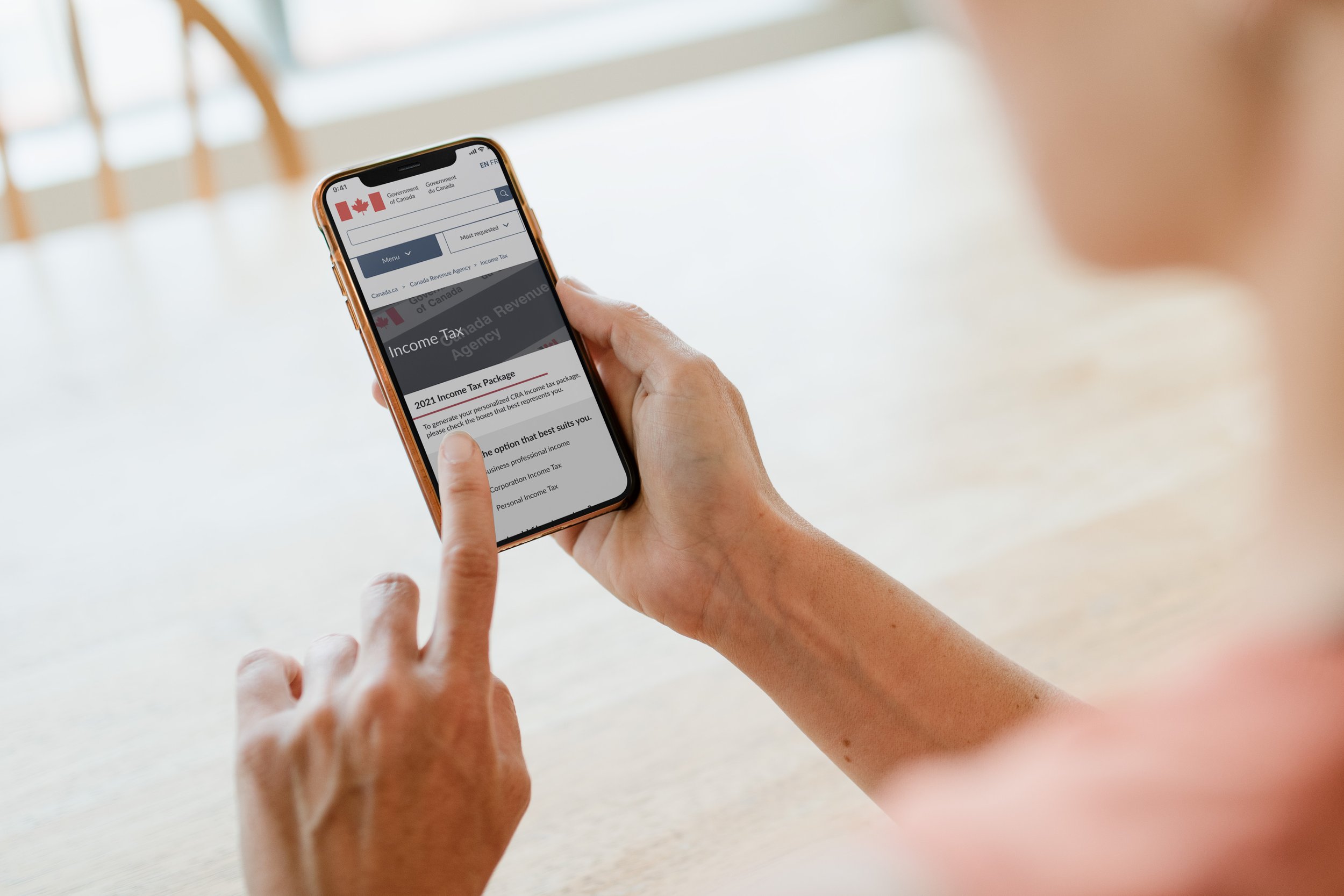
We took a mobile-first approach because we noticed that most people use their mobile phones. Designing for the small screen first ensures that bigger screens will work.
Mobile-Friendly
HI-FI PROTOTYPE
After completing a mid-fi prototype, wireframe, and iterations, I was able to produce a high-fidelity prototype. The primary task flow is to generate a personalized income tax form to download.
Final Outcomes
EMERGING THEME FROM RESEARCH
📝 More Planning
It took us a few days to develop our solution due to the overwhelming content present on the CRA website. We wanted to find a clever yet realistic solution that our users will most defiantly use. Eventually, we took inspiration from banks that have successful results!
Looking back, these are some of the learning outcomes from this project
😞 Bad Design
Users can get used to bad design, but that doesn’t means we shouldn’t change anything.
We should aim to design products that are intuitive for users. The best designs are ones you don’t notice.
♿️ Accessibility
Putting a focus on accessibility— running the new design through an accessibility test. All Canadian will have to use the CRA at some point, so it’s important that our design is accessible to all.