
Product Design | Product Management | Remote
CRA Redesign Project
The Canada Revenue Agency is the revenue service of the federal government, and most provincial and territorial governments. The CRA collects taxes, administers tax law & policy, delivers benefit programs and many more.
Uncovering the pain points from the current user-flow, we redesigned the current homepage to better suit our user’s needs.
TEAM
Ishita Sawant, UX Designer
Sydneigh Vitlen, UX Researcher
Victoria Walton, UX Designer
TIMELINE
6 Weeks
PROGRAM USED

MY ROLE
Lead Designer & Product Manager

Backstory
Goodlife Fitness Centres Inc. is the largest health club company in Canada with over 450 locations across the country, under the banner of four brands. With the recent pandemic, members may feel hesitant to go in-person to high volume establishments, including gyms and fitness classes.
PROBLEM
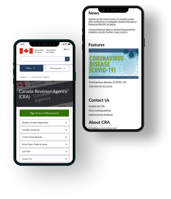
ACSA’s existing website offers information about the resources and services available to their community members.
“How can we improve the navigation across the website by improving the information architecture?”
There is an overwhelming amount of information resulting in poor navigation through the site.

SOLUTION
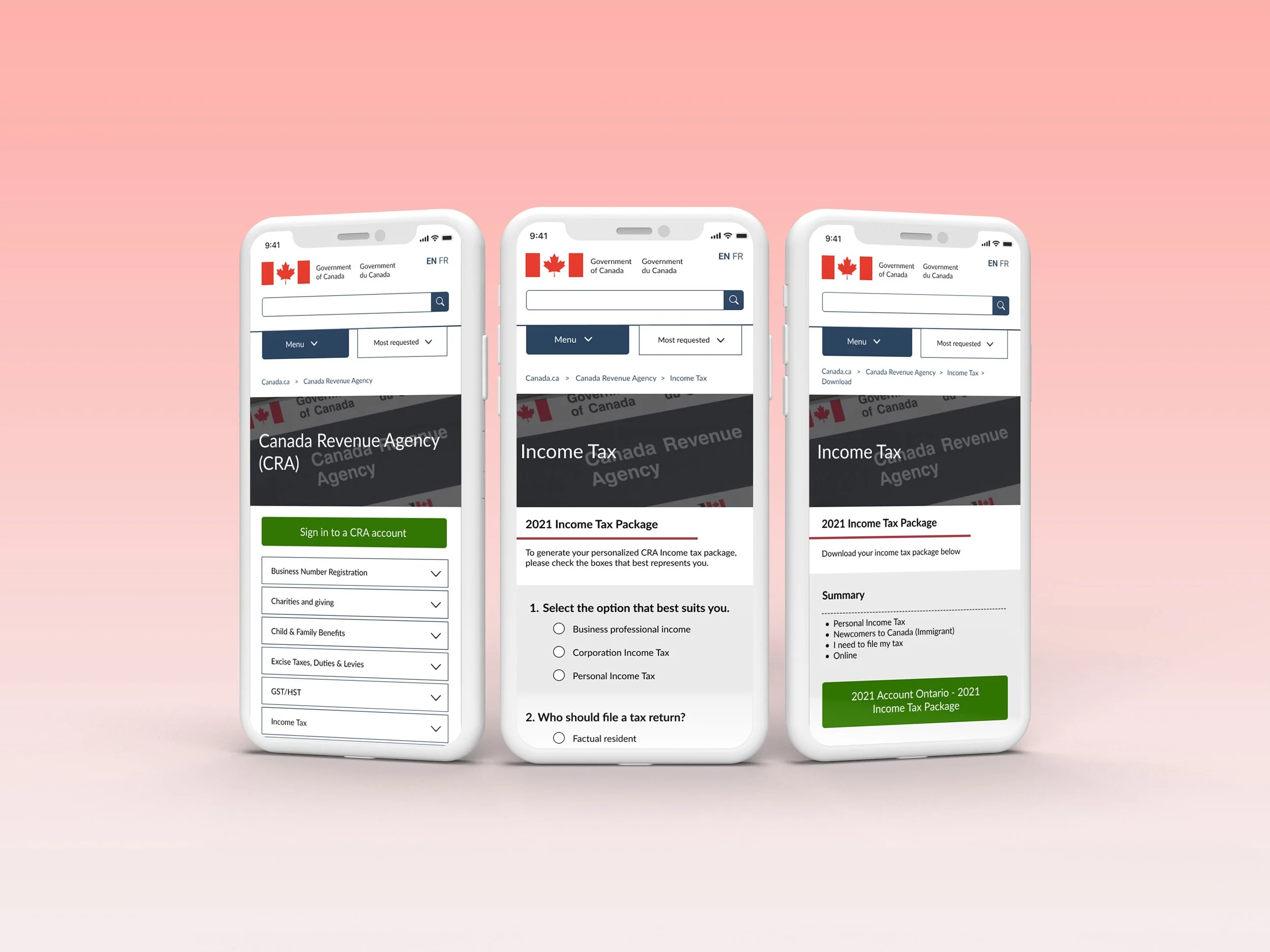
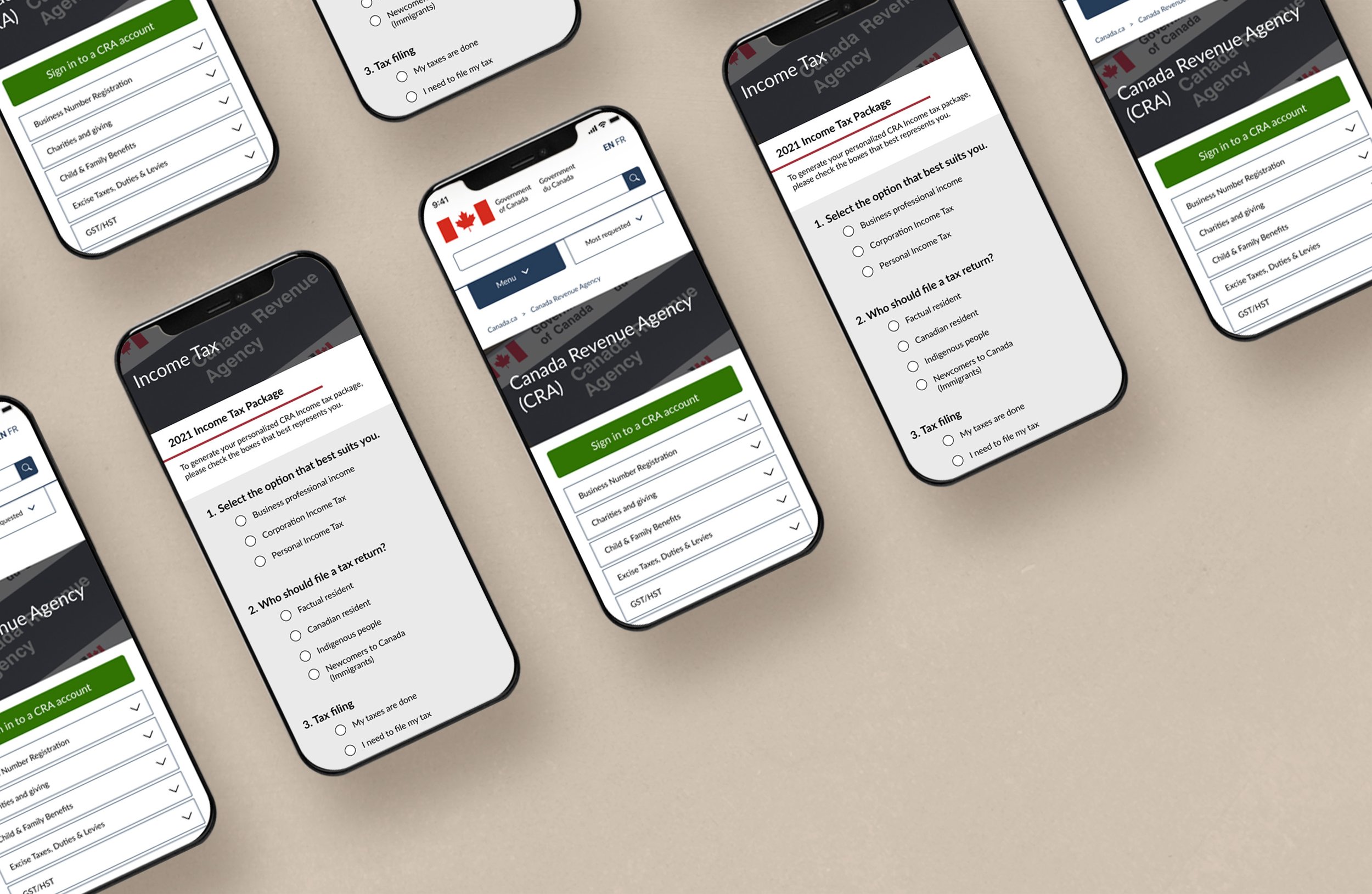
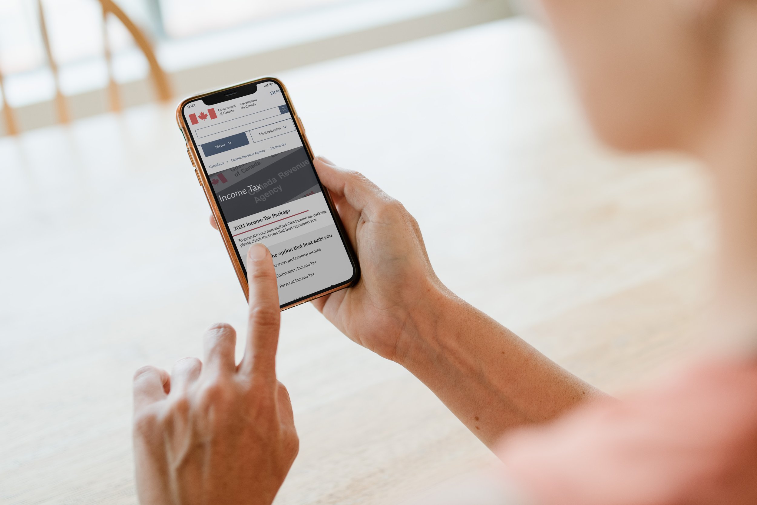
To avoid extreme page depth, we decided to consolidate all the information into a single form that users complete based on their needs. From there, the form will generate a personalized income tax document for users to download.
We believe the solution is a simplified information architecture.

MY PROCESS
WEEK 1
WEEK 2
WEEK 3
WEEK 4
Define
Research
Design & Testing
Ideate
Scope
Problem Discovery
User Interviews
Persona
User flow
Wireframe
Style Guide
Testing
Overall Design
Iterations
DEFINE
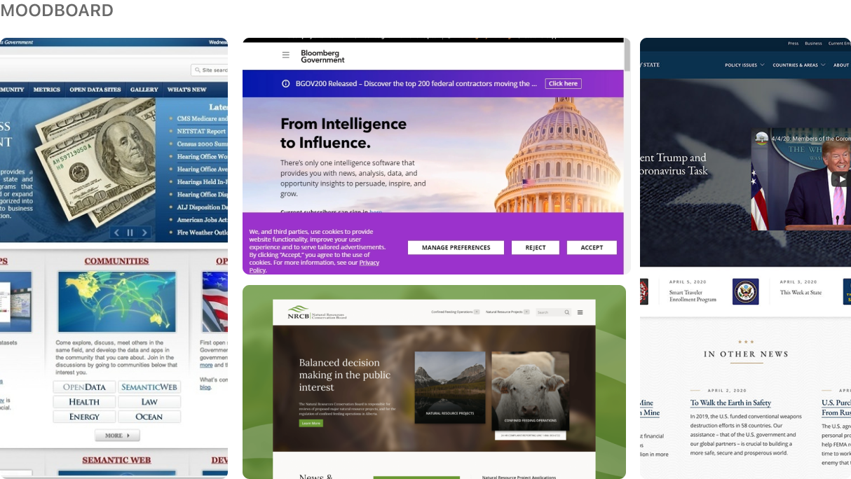
Visual Analysis + Problem Discovery
CRA website is visually appealing— there is no issues when it comes to the UI. However, in terms of user flow and navigation, it takes too many steps to get from point A to point B (ultimately leaving the user frustrated.)

Website depth should be a max of 3 clicks. Any further more posts the risk of confusion.

RESEARCH
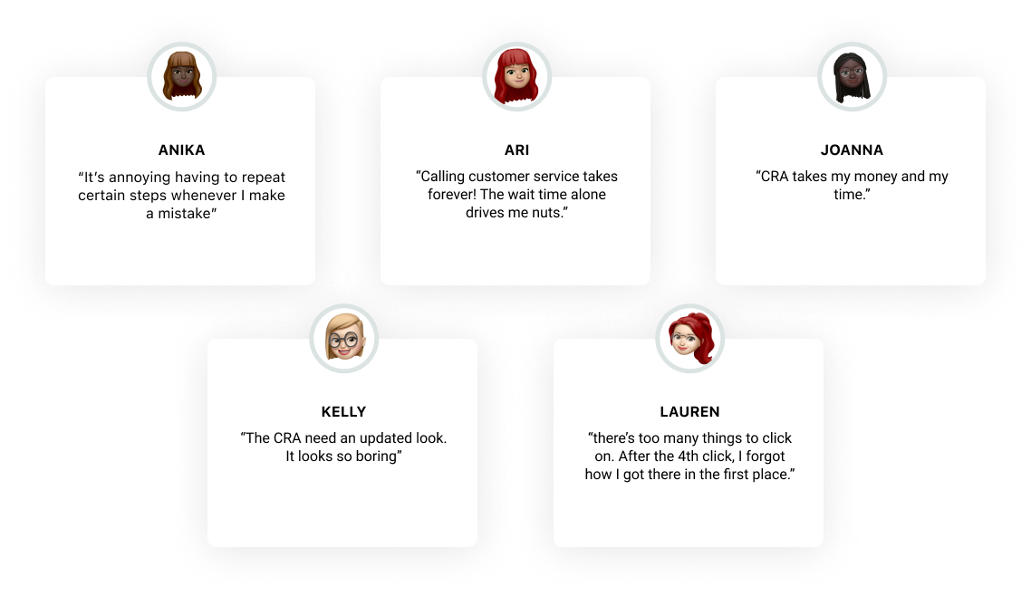
User Interviews + User Test
My objective is to uncover the motivations, pain points, and overall goals of individuals who have experience using with the CRA. Additionally, I hope to gain insight into common themes relating to the problem space so have a better sense of direction on where to go next.
RESEARCH
Research Findings
After completing 5 semi-structured interviews, reviewing notes, and synthesizing that content, these were the main themes that emerged...
TOO MANY STEPS
it took 6 steps from the main CRA page to land on the personal income tax page.
INFO OVERLOAD
Users will get overwhelmed by the amount of info at once.
NOT INTUITIVE

Where to click on next can be confusing because it’s not obvious.
DEFINE
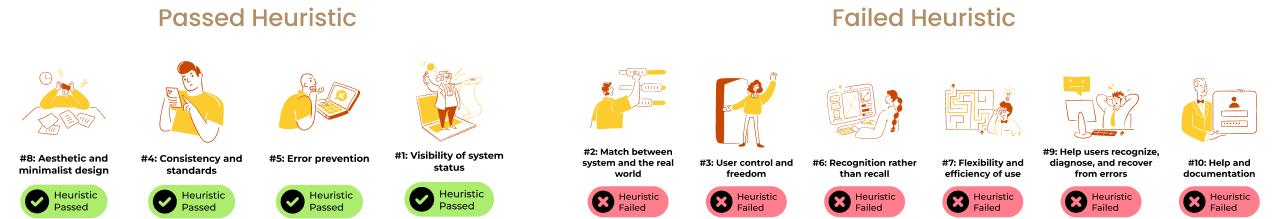
Redlined Heuristics Evaluation
Using Nielsen and Molich's 10 User Interface Design Heuristics rules, we conducted a heuristics evaluation of the current CRA website to rate the usability of the site. We have found it was passed on certain criteria, but failed others.
RESEARCH
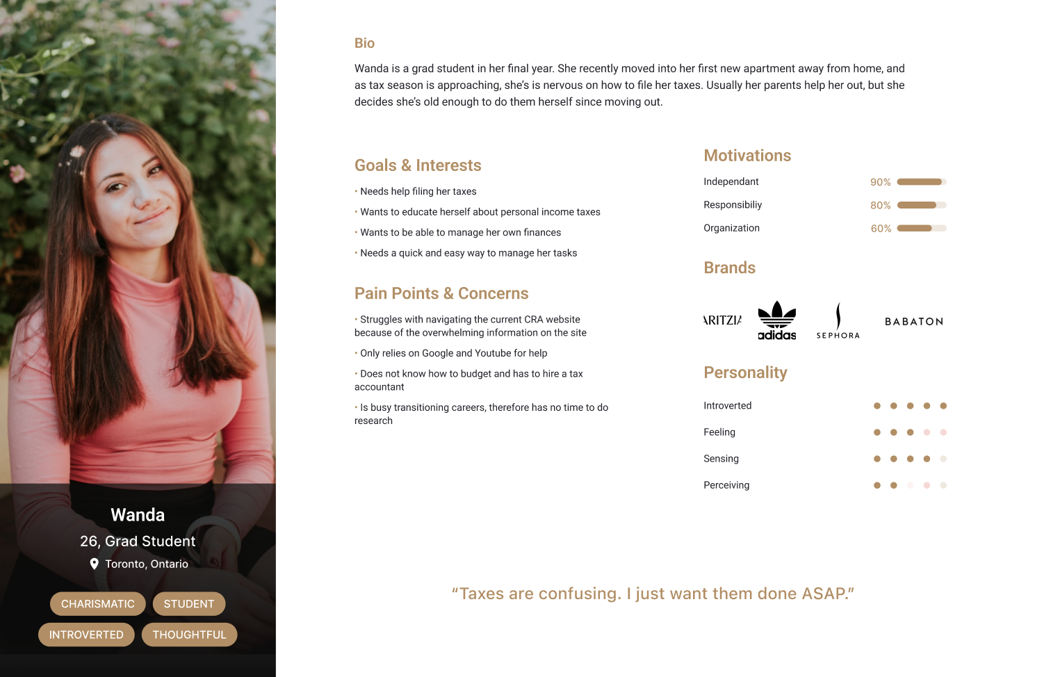
User Persona
To help us gain an even better understanding of our users, we created a persona.

RESEARCH
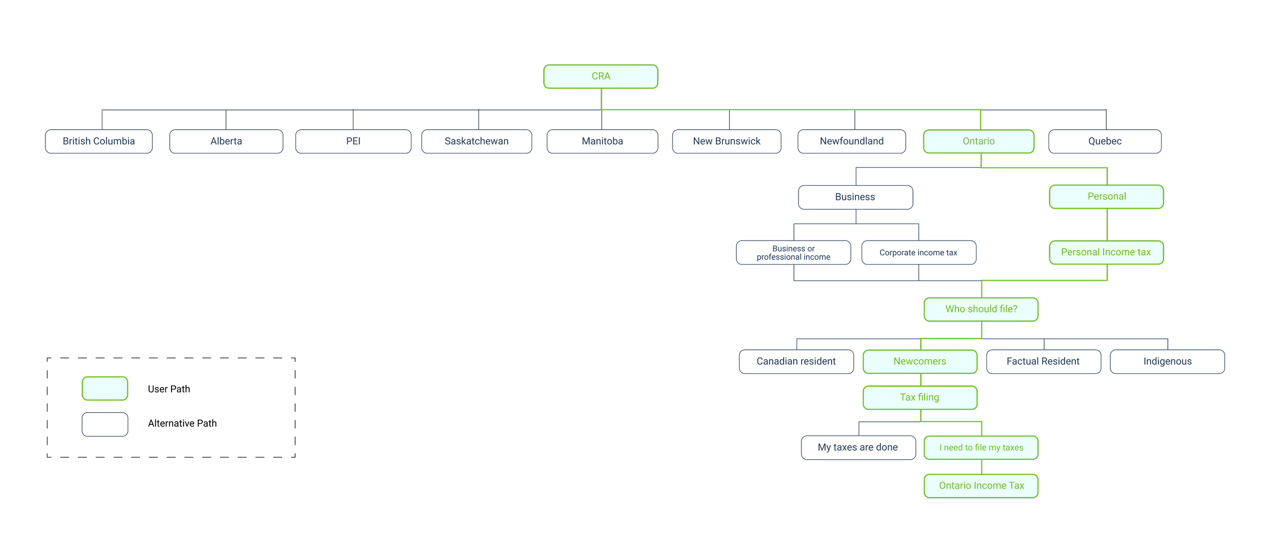
Userflow
Conducting a site map gave us a visual on how information was currently laid out.
We noted that the user path from the homepage to income tax took too many clicks. From online research, a website should avoid extreme page depth because it risks confusing its audience. The CRA’s tax filing process takes its user 9 clicks from the homepage to income tax page. That’s way too many!
IDEATE
Lofi Wireframes
The first step in ideation was to sketch out our ideas on to paper, helping us visualize our solution.

Mobile screens for CRA redesign

IDEATE
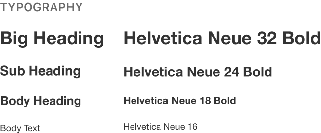
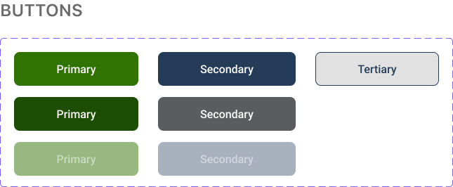
Style Guide + Design Systems
The look and feel is important to branding. We wanted to keep the design true to the Canada.com website.


DESIGN
Overall Design Concept
As a team, we decided that there were 3 main points we wanted to target with our design.

We decide to implement a form that can generate a personal income tax form. Users will check off the criteria that they meet, generating an income tax form for them to download. This will avoid the many layers of pagination, making the developer’s and the user’s life much easier.
Modernizing the homepage
We took a mobile-first approach because we noticed that most people use their mobile phones. Designing for the small screen first ensures that bigger screens will work.
Mobile-Friendly
DESIGN
Design Choices
We built our high-fidelity prototype using Figma. We choose to stick with the same UI style guide as the original CRA website because it gives a sense of familiarity to its users.
We decided to focus mainly on the user flow for this project because, from our user interviews, navigation was the biggest issue. (It would have been impossible to redesign the whole CRA website within the span of 6 weeks!)

REFLECTION
😩 CHALLENGES
It took us a few days to develop our solution due to the overwhelming content present on the CRA website. We wanted to find a clever yet realistic solution that our users will most defiantly use. Eventually, we took inspiration from banks whom have successful results!
💡 WHAT I LEARNT
Users can get used to bad design, but that doesn’t means it’s a good experience.
⭐️ FUTURE DEVELOPMENT
Putting a focus on accessibility— running the new design through accessibility test. All Canadian will have to use the CRA at some point, so it’s important that our design is accessible to all.
Wanna see more projects 👀