
Non-Profit Redesign
RESPONSIVE WEB DESIGN • USER RESEARCH
ACSA is a nonprofit organization that provides resources and services to vulnerable populations within Scarborough. The company has been operating for over 20+ years with the same interface since the early 2010s. As I was recently hired by ACSA, we took this opportunity to redesign the website to modernize the UI making it more delightful for their users.
INTRODUCTION
MY ROLE
User research, synthesize, product design, and style guide.
THE TEAM
3 designers
TIMELINE
June 2022 - August 2022
BACKSTORY
Summer of 2017, I was hired as a nutrition summer student for ACSA. Recalling the job application process, I struggled with locating the “career” page and even questioned the legitimacy of the organization due to the poor UI.
Fast forward to 2022, I’m currently working as the Communication Specialist for ACSA. The website’s UI hasn’t changed in the last 5 years, thus the pain points I felt resurfaced again.
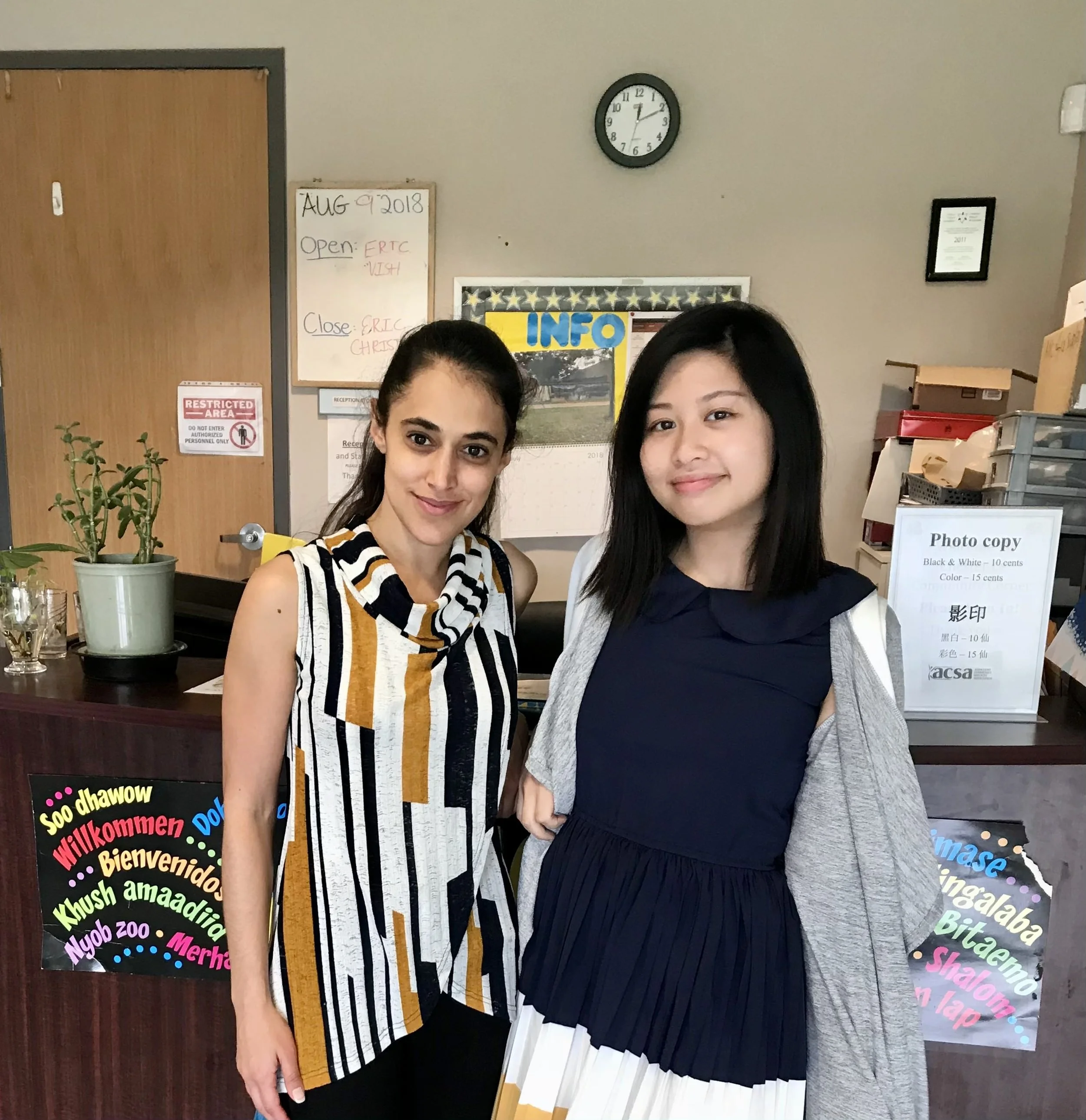
← This photo was taken 5 years ago when I was a nutrition summer student (My manager and I were twinning!)

PROBLEM STATEMENT
ACSA’s current users (the majority are newcomers) find navigating the user interface challenging because of poor usability and the absence of responsive design. As a result, users frequently call ACSA's phone line, leading to increased phone traffic intended for client calls. How might we improve the current website’s user experience to reduce this high volume of calls and enhance usability?
SOLUTION
To redesign the current website with a focus on UI. We believe designing a mobile-friendly website for our users (newcomers looking for program information) will result in a better user experience.

DEFINE
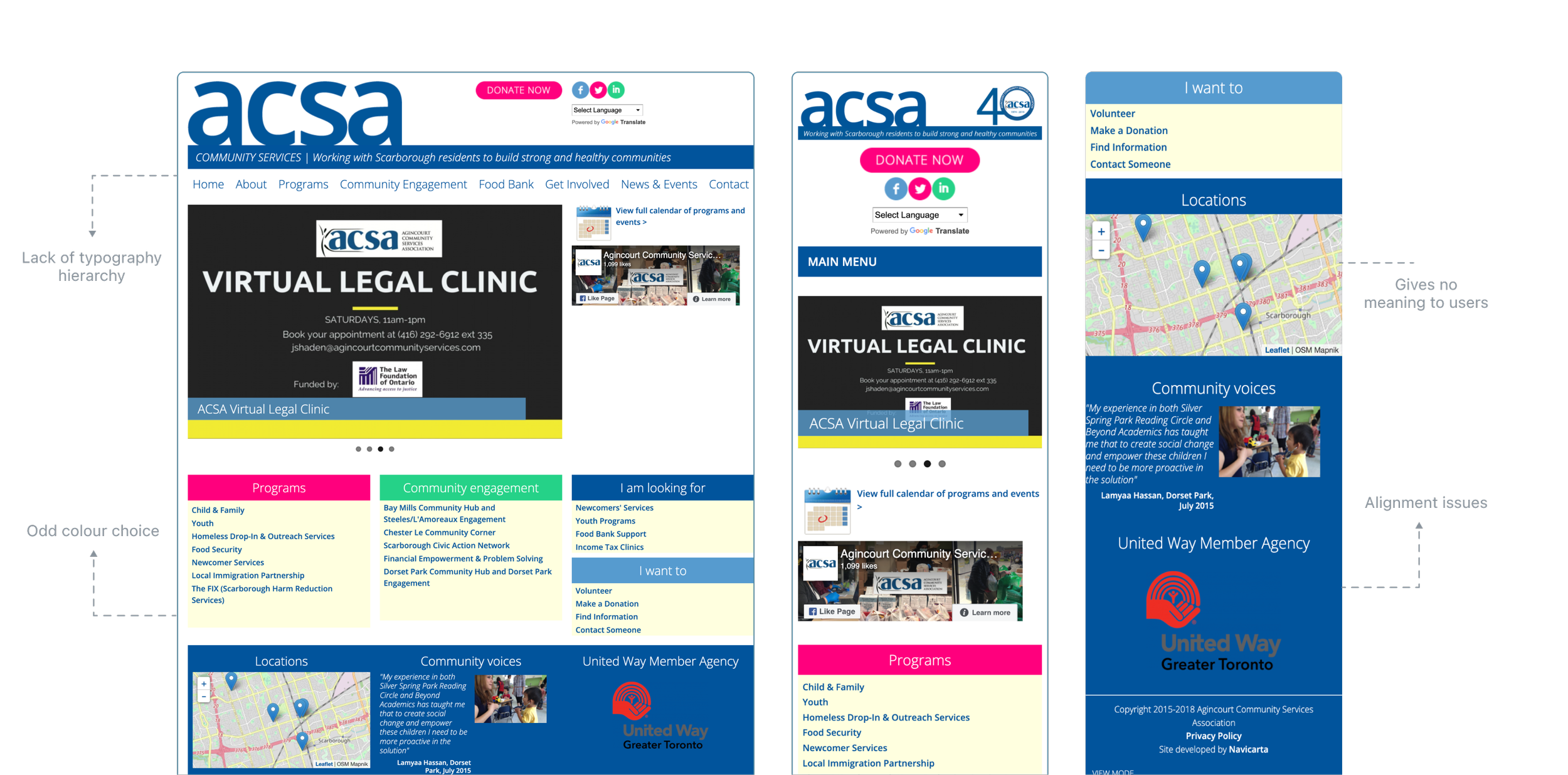
Inconsistency in visual design— Random use of colors and typography that provide no meaning to users. UI needs major improvements.
Lack of responsive design. Website was design with only desktop in mind.
The project kickoff started with a visual analysis of the current website.
KEY TAKE AWAYS
PRELIMINARY USER RESEARCH
My objective was to uncover the pain points and motivation of our users. Additionally, I hope to find common themes relating to the problem space.
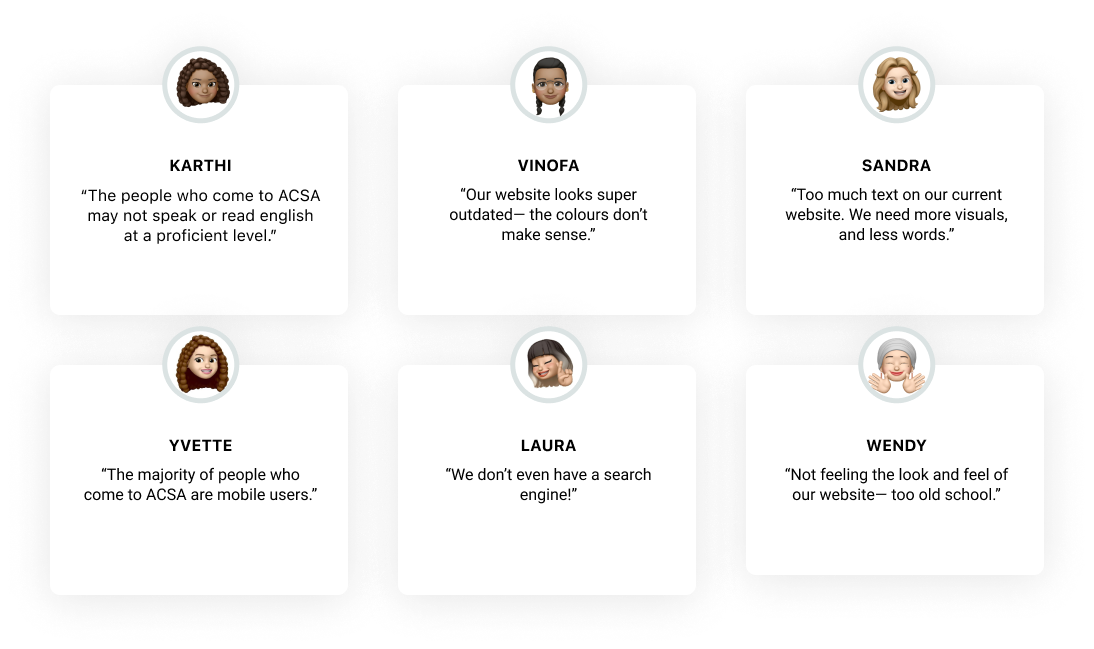
Our users included individuals from diverse backgrounds, with one common theme— all being newcomers to Canada.
I conducted 5 semi-structured interviews in-person with ACSA staff members who have been with the company for at least 5+ years.
Let’s dive into research.
KEY TAKE AWAYS
AFFINITY MAP
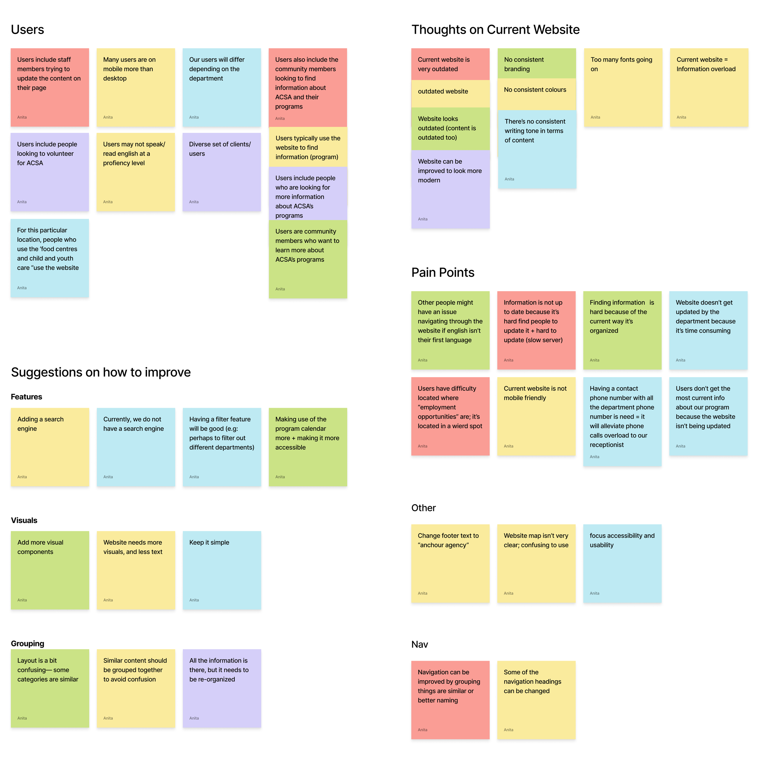
To organize the interview data, I consolated the info into an affinity map to find emerging trends and pain points of our users .
EMERGING THEME FROM RESEARCH
📱 Mobile First
The current website is not optimized for mobile use. It was design for desktop in mind.
🏛 Information Architecture falls short
Users are having issues navigating the website, making it frustrating to find the content they want.
📖 English Comprehension Limitation
Users are newcomers to Canada with limited English comprehension— keep this in mind during UX writing.
🔎 Poor Searchability
Despite this website being content-heavy, there’s no search engine available.
SOLUTION
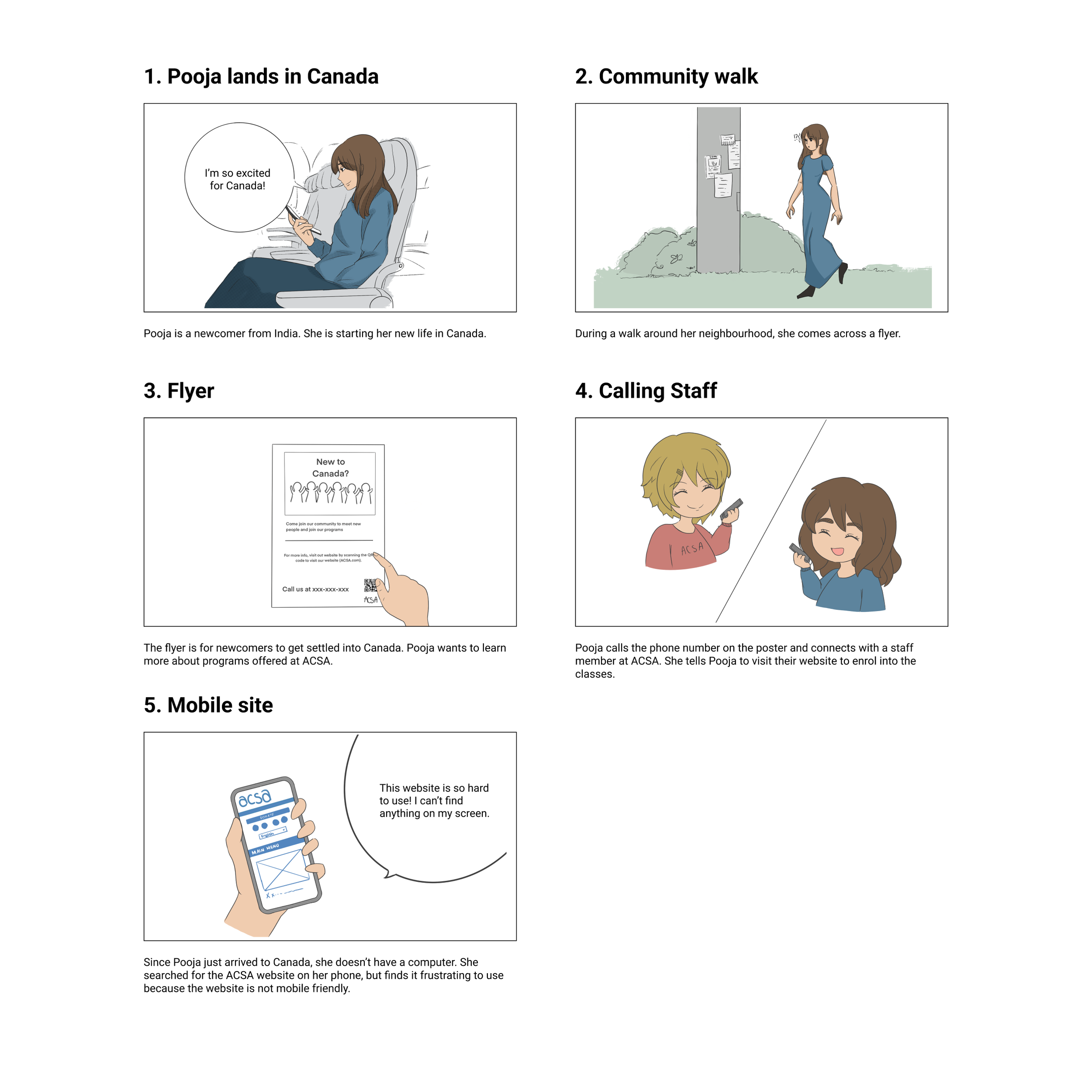
User Persona, User Journey Map, and Storyboard
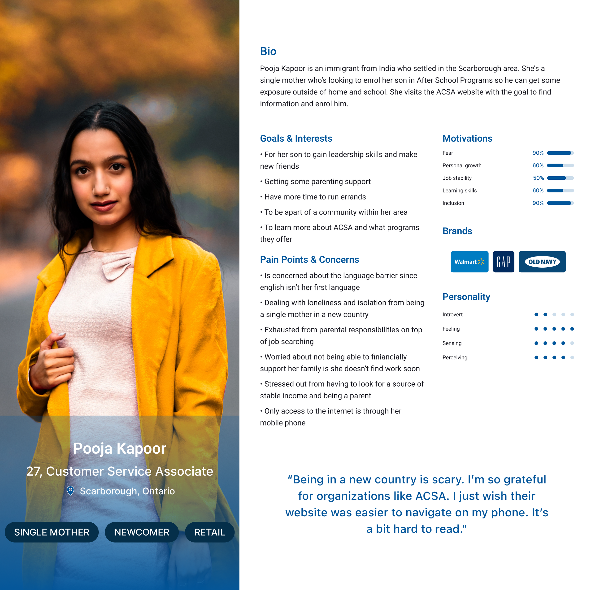
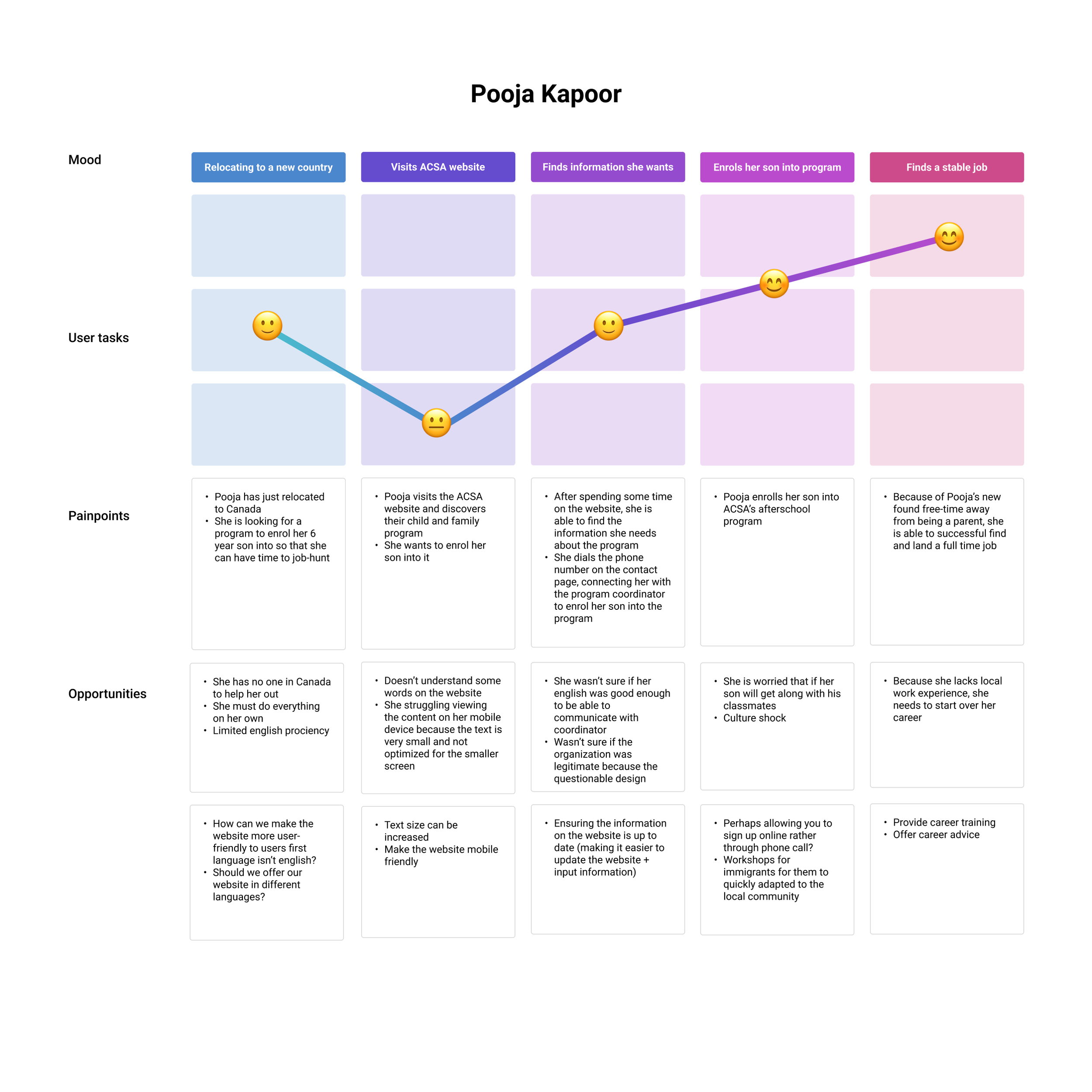
After gathering insights from our user interviews, we used that data to synthesize our user persona and storyboard to help us empathize with our users.
How might we improve the current website's user experience by making it easier and faster to discover information about Child and Family programs?
-
![]()
Persona
-
![]()
User Journey Map
-
![]()
Storyboard
PRELIMINARY USER RESEARCH
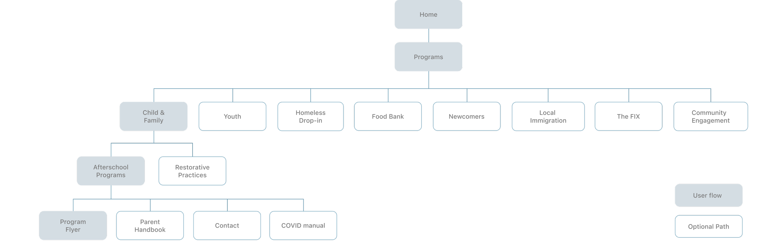
After defining the problem space, I then visualized the user flow by creating a chart. Since redesigning a whole web page would be impossible within 3 weeks, I focused on redesigning our user flow for users enrolling into programs.
CONCEPT SKETCHES
The purpose of having a lo-fi prototype was to start testing ASAP to identify any issues with the primary flow. However, with the time constants, we moved on to mid & hi-fi prototype.
Using the user-flow as a guide, I created wireframes on potential designs

VISUAL IDENTITY
For this redesign, I wanted to spend time exploring the visual identity of the company, and hence the website. I started by brainstorming a list of adjectives that represented the brand well.
From our user research, we concluded the lack of a style guide


Using this list, I put together a moodboard
COLOUR & TYPOGRAPHY
Color invokes certain moods and emotions, so choosing the right colors is important to any brand identity. Using a style guide keeps components consistent and professional.
To keep the sense of familiarity, I decided to stick with the same color palette as before.
As for typography, I used Helvetica Neue for a clean look and feel.


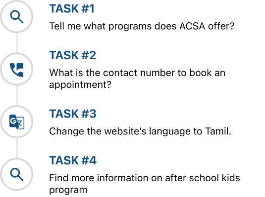
USER TESTING
The test found that I needed to improve the legibility of our website— we found that most users don’t read content, but rather scan for info.
Guerrilla testing was conducted the lo-fi prototype to test the overall experience through my design
USER TESTING
Imagine you and your family are newcomers to Canada and are looking to find out more information about adapting to the new life. Your new neighbor tells you to visit the ACSA website because they offer many different programs and services. You notice that they offer programs for children, so you want to enroll your son in their after-school program. How might you go about completing this task?
DEMOGRAPHICS
Interviewees were members of the ACSA community center, aged 26-50 who have visited the ACSA website before + frequent the community center. I conducted 5 user tests.
RESULTS FROM USER TESTING
📱Too much text — more visuals
Users felt there was too much text on the homepage, especially for the introduction of the program
Given that our target users are newcomers with limited English, pictures help provide a visual aid.
🏛 More white space
Users are having issues navigating the website, making it frustrating to find the content they want.
The lack of white space makes the text difficult to scan, making it challenging for users to find certain features.
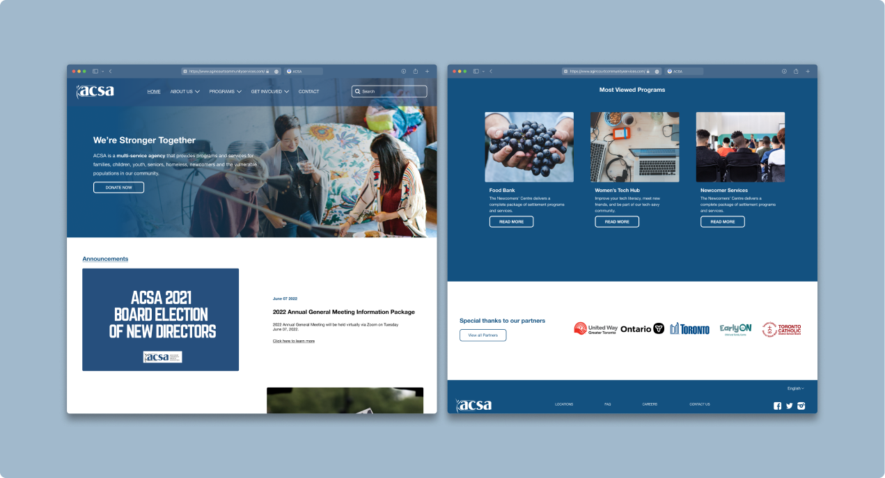
FINAL DESIGN
The test found that I needed to improve the legibility of our website. I made some design iterations and here are the final screens.
Guerrilla testing was conducted on the lo-fi prototype to test the overall experience through my design
HIGHLIGHTS
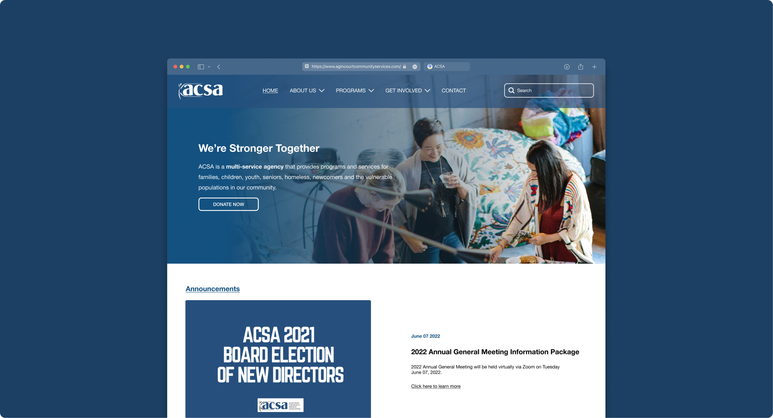
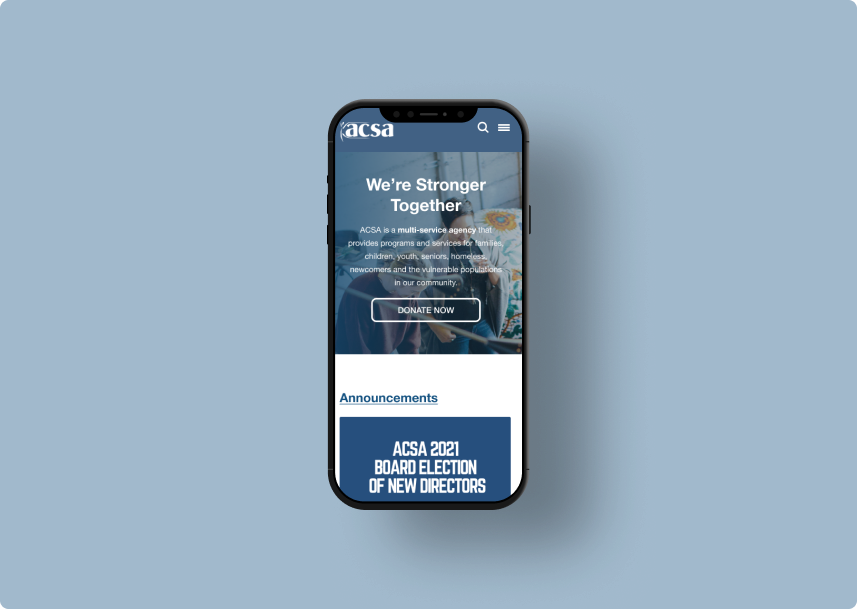
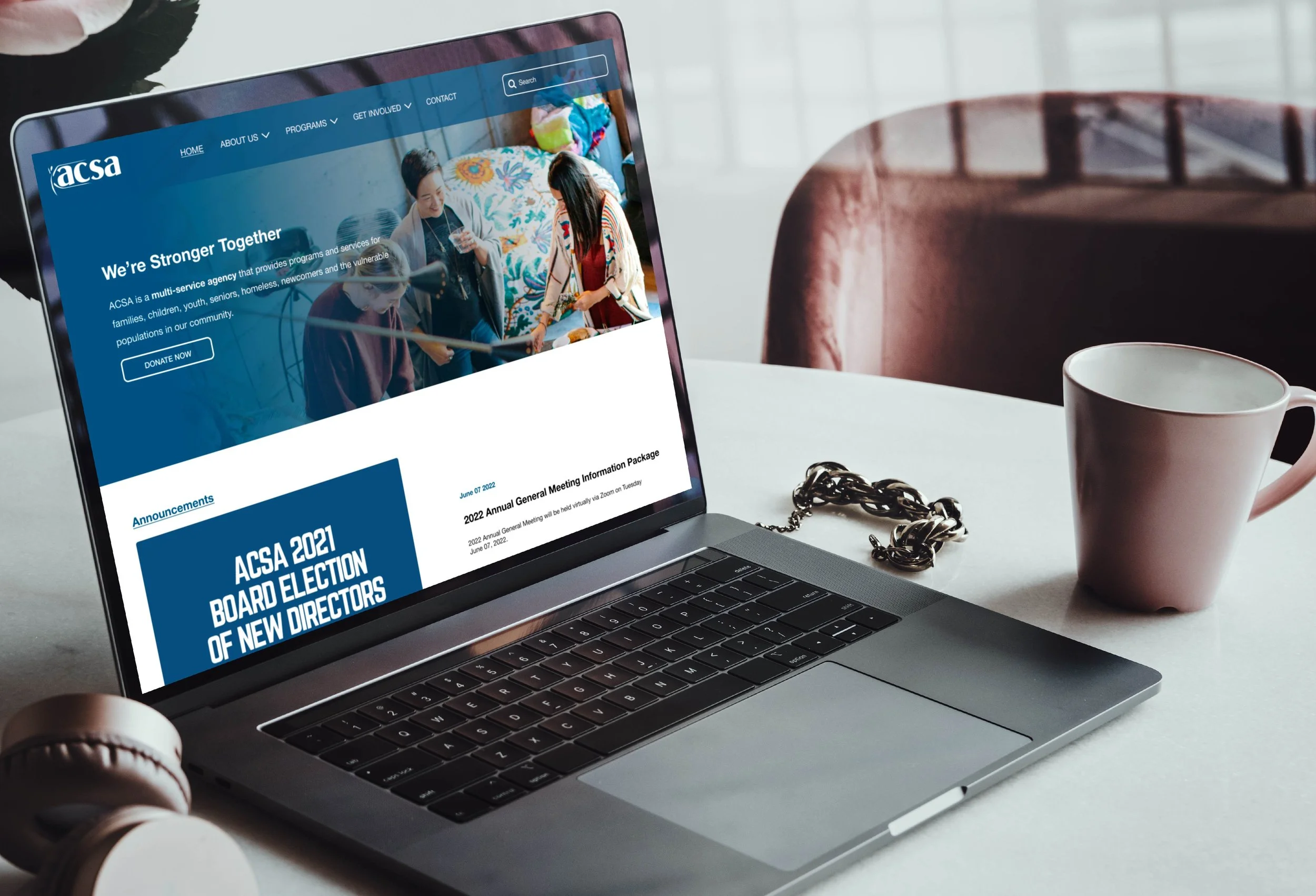
Since the homepage is the first page most users land on, I wanted the UI to look as clean and modern as possible.
Research shows that users spend only 15 seconds on a web page— so what they take away from those 15 seconds must count.
Modernizing the homepage with a focus on visuals
HIGHLIGHTS
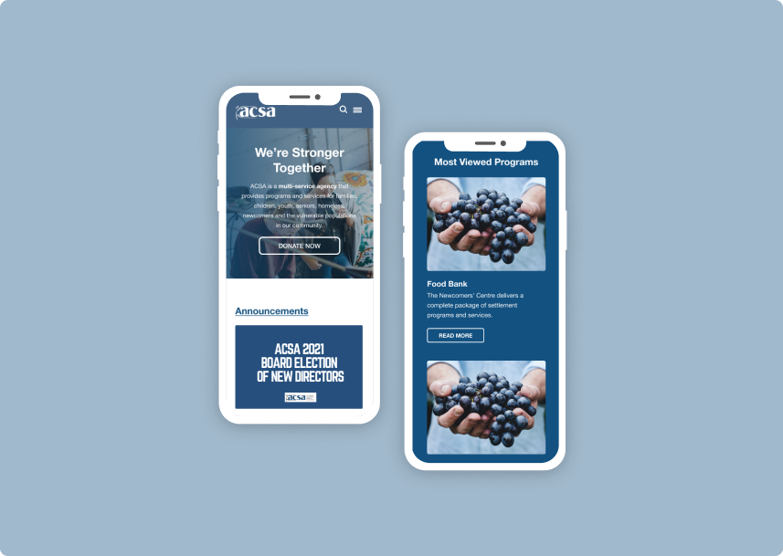
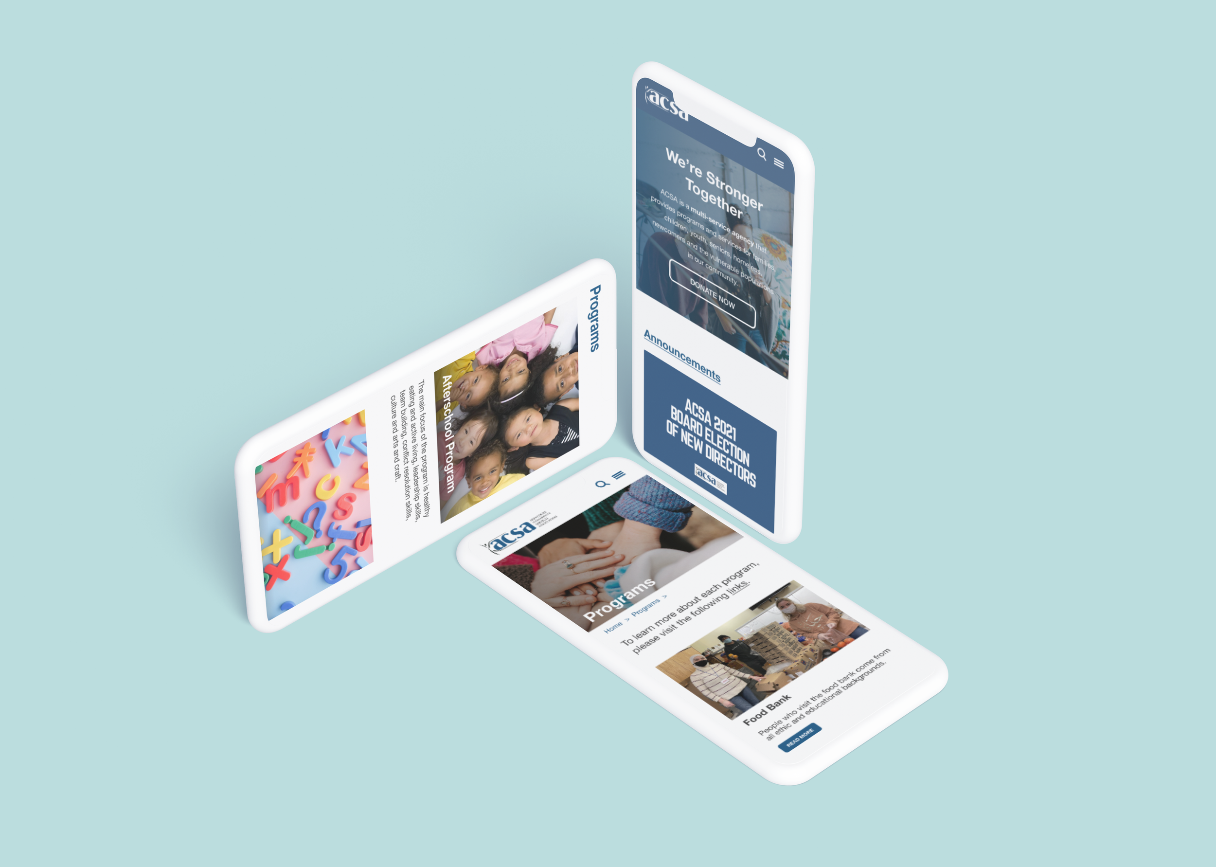
Since the majority of community member’s main access to the website is through their mobile devices, we used the RWD approach to create dynamic web pages for both mobile and desktop.
Mobile-friendly
HIGHLIGHT ITERATIONS
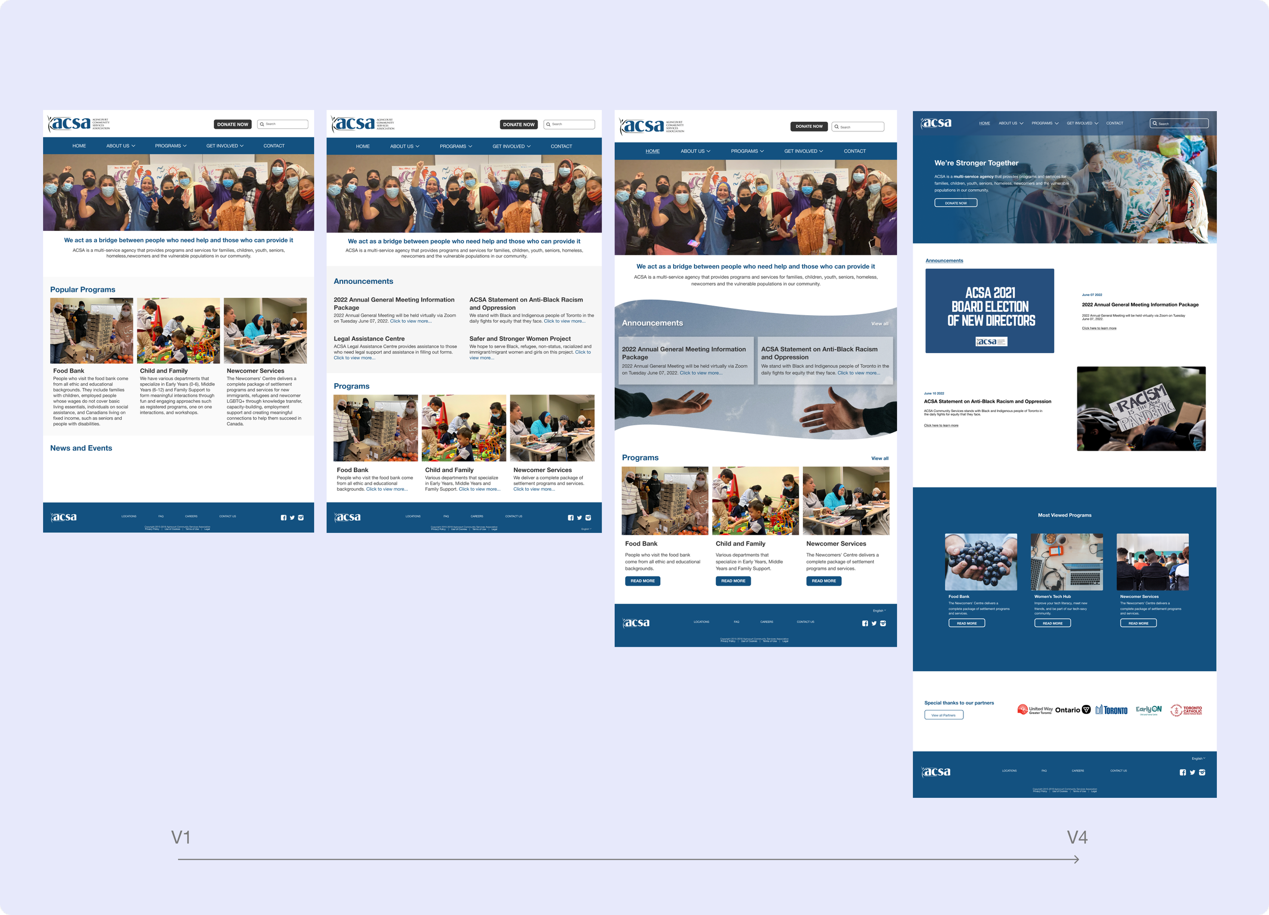
The double-diamond model is not linear— It’s a very iterative process with lots of back and forth. Here are some drafts showing the design progress made via user testing and feedback.
Since homepage is the first page our users will land on our website, we spent a considerable amount on it. Here are all the iterations we’ve made. We ultimately decide to focus more on visuals > text.
I went through many iterations of the homepage before settling with the final design (for now)
MORE ITERATIONS
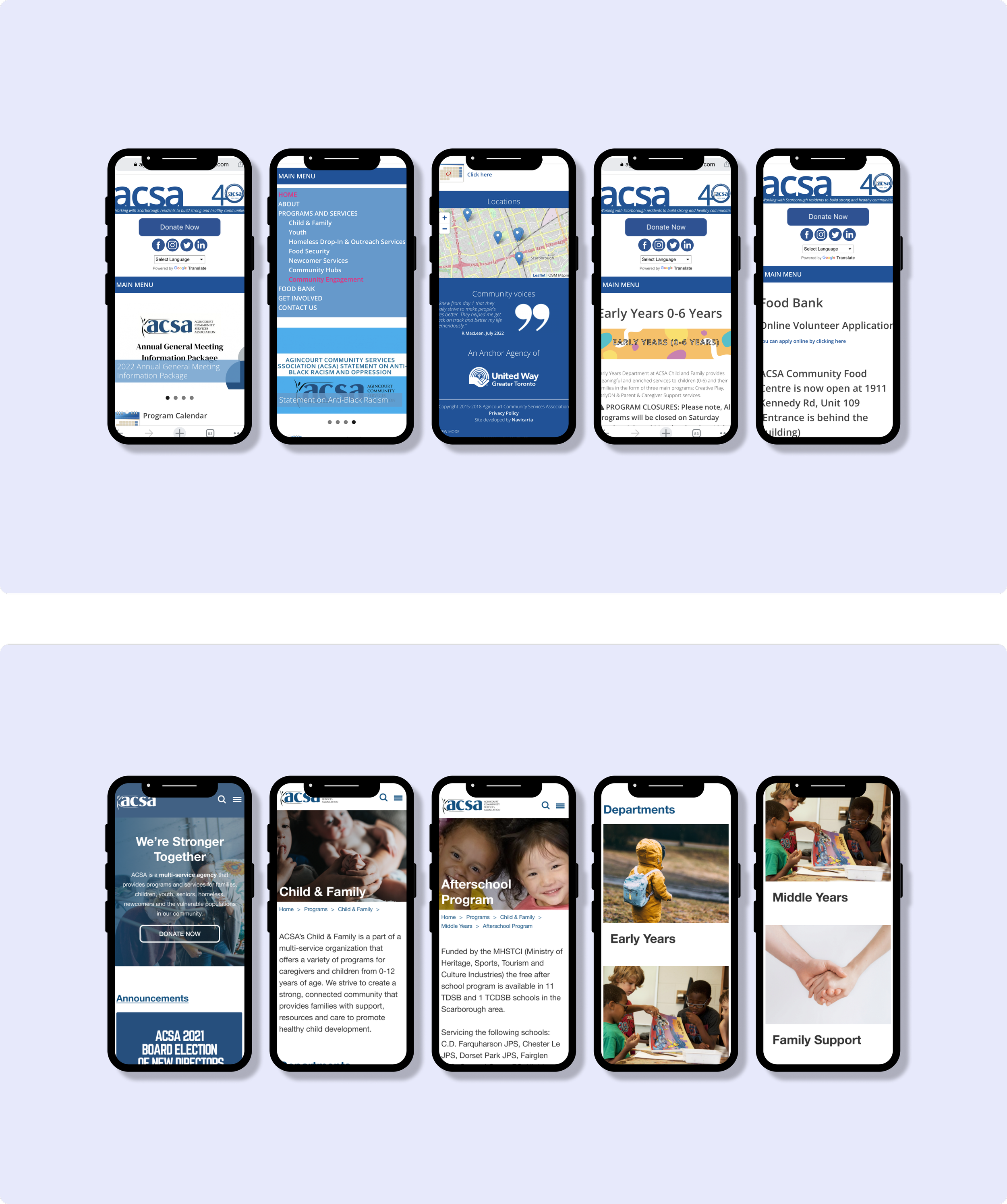
Mobile screen comparison (V1 & Final)
HI-FI PROTOTYPE
After completing a mid-fi prototype, wireframe, and iterations, I was able to produce a high-fidelity prototype. The primary task flow is looking up information on the afterschool programs for children.
Final Outcomes

KEY LEARNINGS
🗣 Interview Actual Users
Looking back, it would make sense to interview the people actually using the website, rather than the staff members that observed their behavior. This source of primary research may have uncovered different insights.
Looking back, these are some of the learning outcomes from this project
♠️ Card Sorting
As per my PM’s request, the user path was kept the same as the original path because deviation could cause confusion with existing users. However, upon reflecting, I believe we should have redesigned the whole AI because to make it intuitive for new users. We want to draw in new users to the company, so having a delightful UX is a great start.
🧪 Test Quick and Often
Products don’t need to be perfect in order to begin testing. During the early stages of design, It’s more important to get feedback from user testing than to have a completed prototype. This way you can move forward and keep iterating. Rarely the first prototype is perfect, so I need to learn to let that idea go.