


UHN’s Ned App
USER RESEARCH • REDESIGN
The most common type of cancer in Canadian men is prostate cancer, as 1 in 9 men will be diagnosed with it at least once in their lifetime (Canada, 2020). Ned is a web app that adopts an asynchronous model of care, allowing patients to manage their health remotely by submitting monthly assessments. The purpose of Ned is to offer a health management tool for prostate cancer survivors, streamlining the current care model and enabling patients to visit the clinic only when necessary. This approach saves time, alleviates hospital overcapacity
This redesign retrospects the current user experience and introduces a nurse feature to alleviate the current pain points. Adding a nurse-led model will offload overburdening oncology specialists while maintaining effective survivorship care.
INTRODUCTION
MY ROLE
User research, synthesize & product design
THE TEAM
2 designers, 1 product manager
TIMELINE
October 2023 - January 2024
“When I was first diagnosed, it felt so lonely. I felt like the only man on this planet going through this experience.”

Ash Harvey, 56 Prostate Cancer Survivor
BACKGROUND INFORMATION
Currently, Ned allows communication between patient and clinician. Every month, patients have to complete 2 tasks: an EPIC-26 assessment and a blood test. These two tasks will be submitted to the doctor for review.
The EPIC-26 questionnaire is a validated assessment that measures 4 health-related quality of life domains including urinary function, bowel moment, sexual function, and hormonal state. The blood test can be completed at any blood test center. The doctor will review both submissions to determine the next course of action for the patient. Once the patient receives that information, they will respond accordingly and wait until the following month for their next submission.
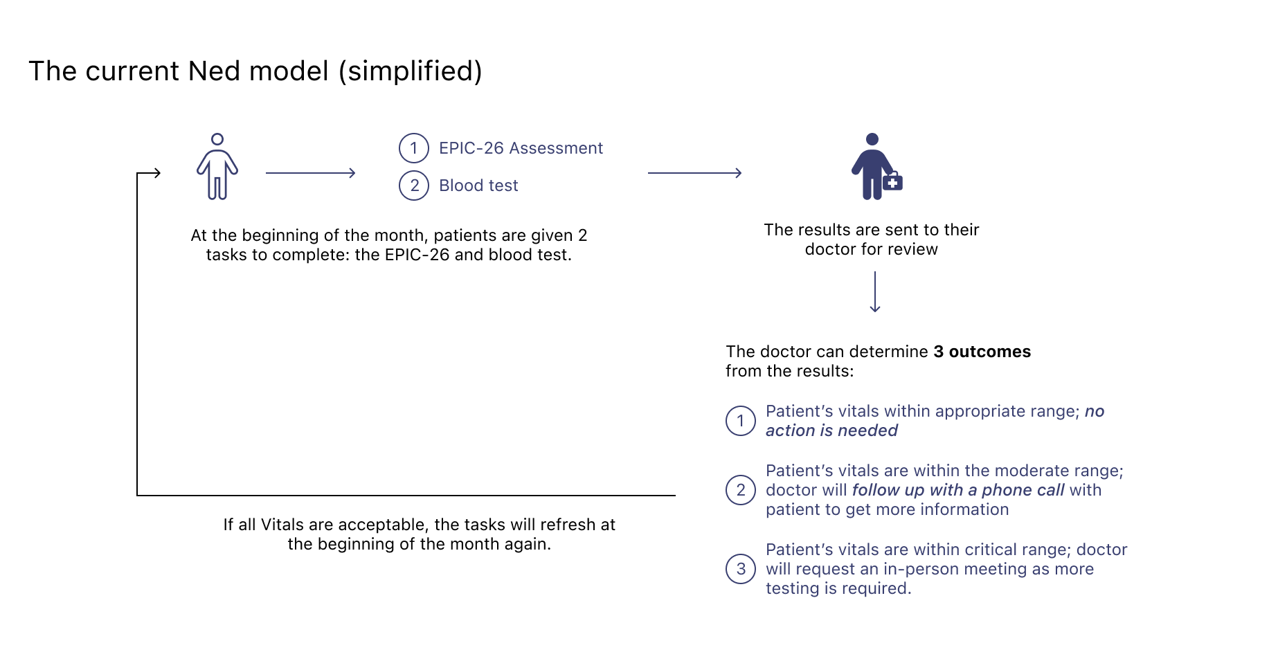
How Ned currently works

Ned was designed to give prostate cancer survivors access to health information and manage their ongoing health challenges. However, we have observed that Ned is not offering sufficient healthcare information, reducing user engagement with the app.
How might we enhance the experience for existing Ned users who feel anxious about cancer relapse by facilitating proactive communication with their healthcare team?
PROBLEM STATEMENT
SOLUTION
To redesign the UX experience for current Ned users. We believe revisiting the current experience and improving the language and features will result in a better user experience.

PRELIMINARY PHASE
My design lead approached me to take on a redesign project after field studies indicated the necessity for one. Data analytics revealed that Ned was not being utilized as intended, with users failing to submit wellness surveys on time and doctors experiencing delays in responding to users. Users stopped using Ned, and thus failing to keep their health management up to date.
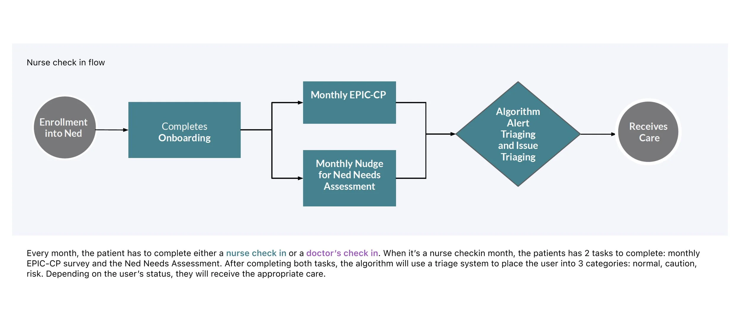
This prompted the research team to uncover the root cause, concluding that doctors' busy schedules hindered timely communication with patients. As a solution, the team proposed introducing a nurse feature to conduct check-ins between the doctor check-ins. Given the higher number of nurses than doctors, they could effectively cover patient check-ins more frequently.
Requirements gathering
DISCOVER
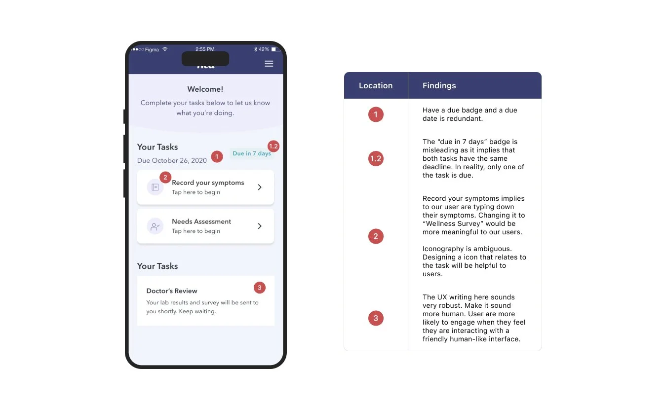
Inconsistent and confusing design language - Some of the language was not clear and concise and could be interpreted differently by different people. The wording was ambitious as it often made the user question what the question was asking.
Limited resources - The purpose of the app is to help prostate cancer survivors manage their health. However, aside from completing the surveys, there was not much else to do. There are no resources to help manage one’s health.
We kicked off the project with a UX analysis of the current app.
DISCOVER
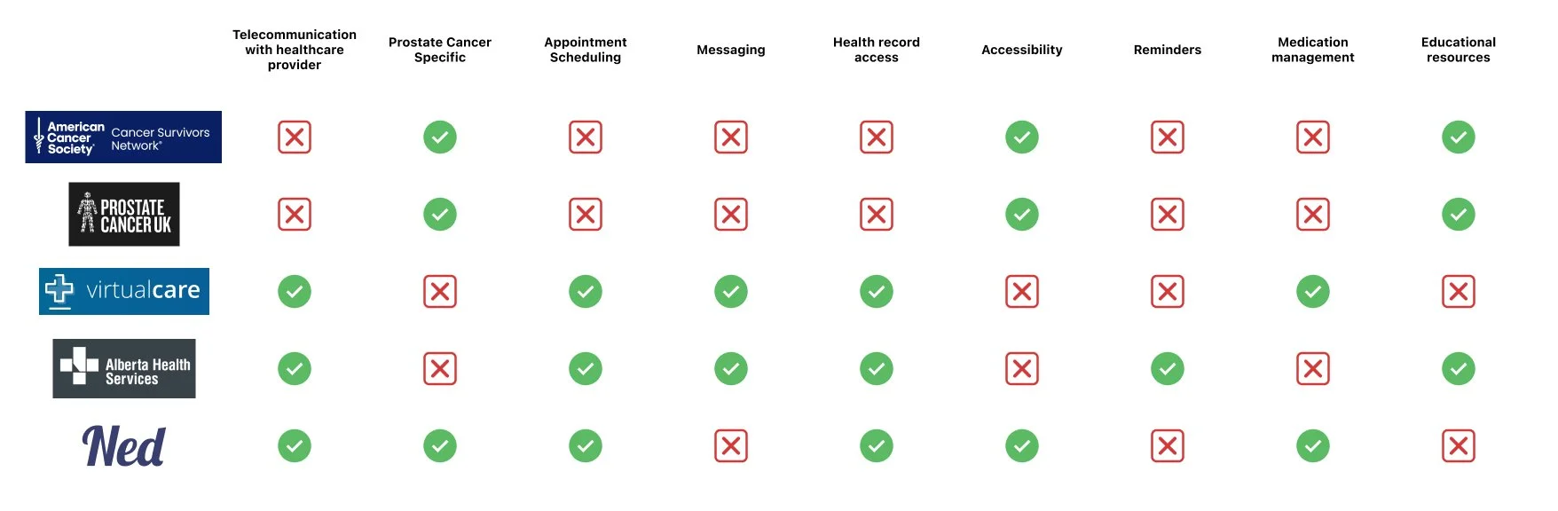
We have found that competitor apps in the market offer a variety of resources and telecommunication features. However, while some prostate cancer-specific websites provide educational resources, they lack telecommunication capabilities. Conversely, apps offering telecommunication and health record access are not tailored specifically for prostate cancer and often lack any educational resources.
The Ned app addresses this gap by targeting prostate cancer survivors and offering a unique combination of resources, telecommunication options, and health record access tailored to their needs.
What’s in the Market - Competitive Analysis
DISCOVERY: USER RESEARCH
My objective was to uncover what the current Ned user feels about the app. This includes what issues they are facing, and what they like or dislike about it.
Our user group was existing Ned users, who are also prostate cancer survivors.
I conducted 6 semi-structured interviews over Zoom with Ned users ranging between the ages of 50-65.
Let’s speak to Ned users to understand them better.
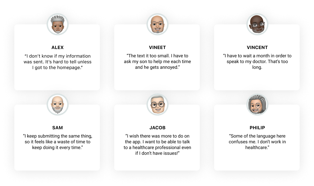
EMERGING THEME FROM RESEARCH
🤨 Unclear feedback
5/6 users expressed uncertainty regarding the status of their sent-off information after completing the surveys. The absence of a feedback loop left our users feeling confused about the next steps and the fate of their information.
🗣️ Confusing Language
Certain titles and labels within the app were misleading for our users. Upon reflection, it became evident that the language used was tailored more towards backend functionality, lacking the user-friendly approach necessary for optimal user experience.
👩🦽Accessibility
As our user group was an older demographic, their technology literacy. To accommodate poor vision, text should be larger, and high contrast should be employed for accessibility purposes.
🏛️ Inadequate IA
Users encountered difficulty locating certain items because they were tucked away in unexpected locations. It became apparent that restructuring the information architecture to enhance intuitiveness was necessary.
SOLUTION
User Persona, User Journey Map, and Storyboard
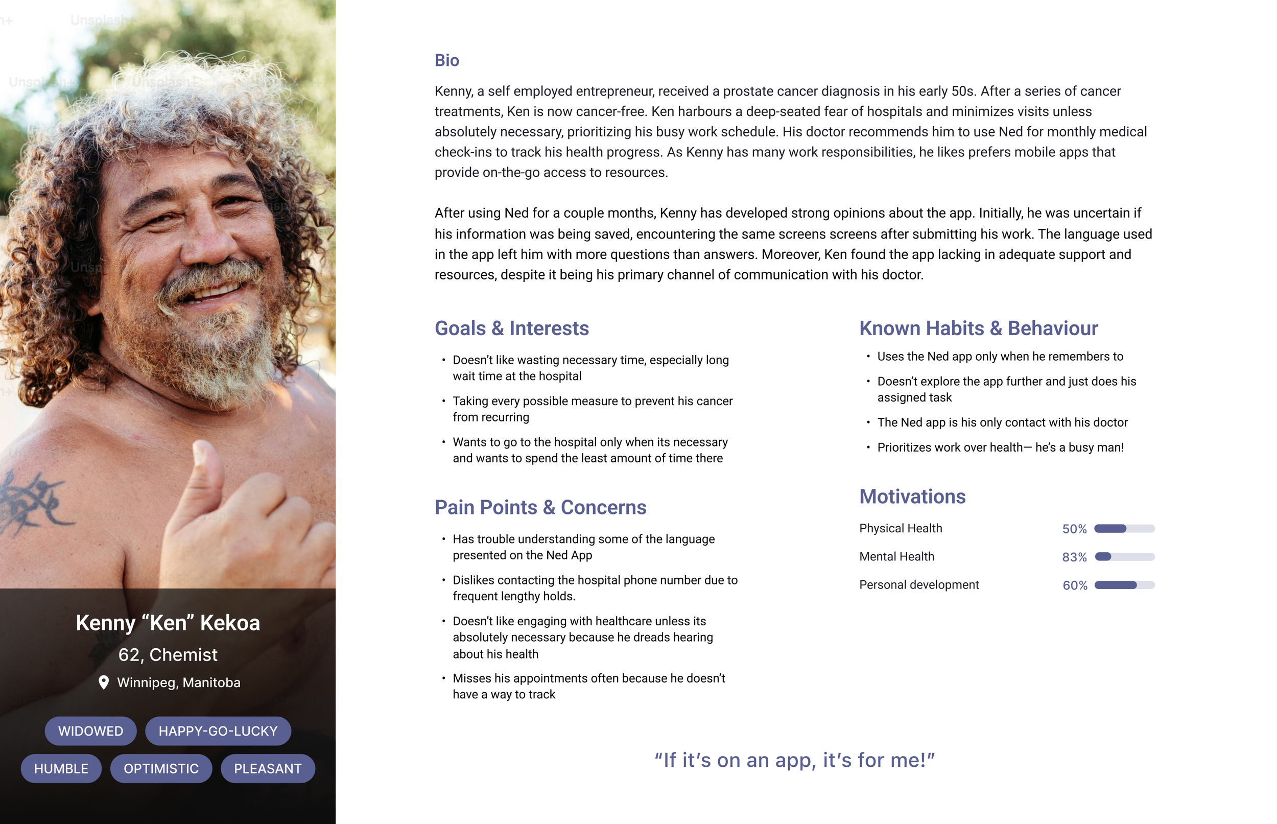
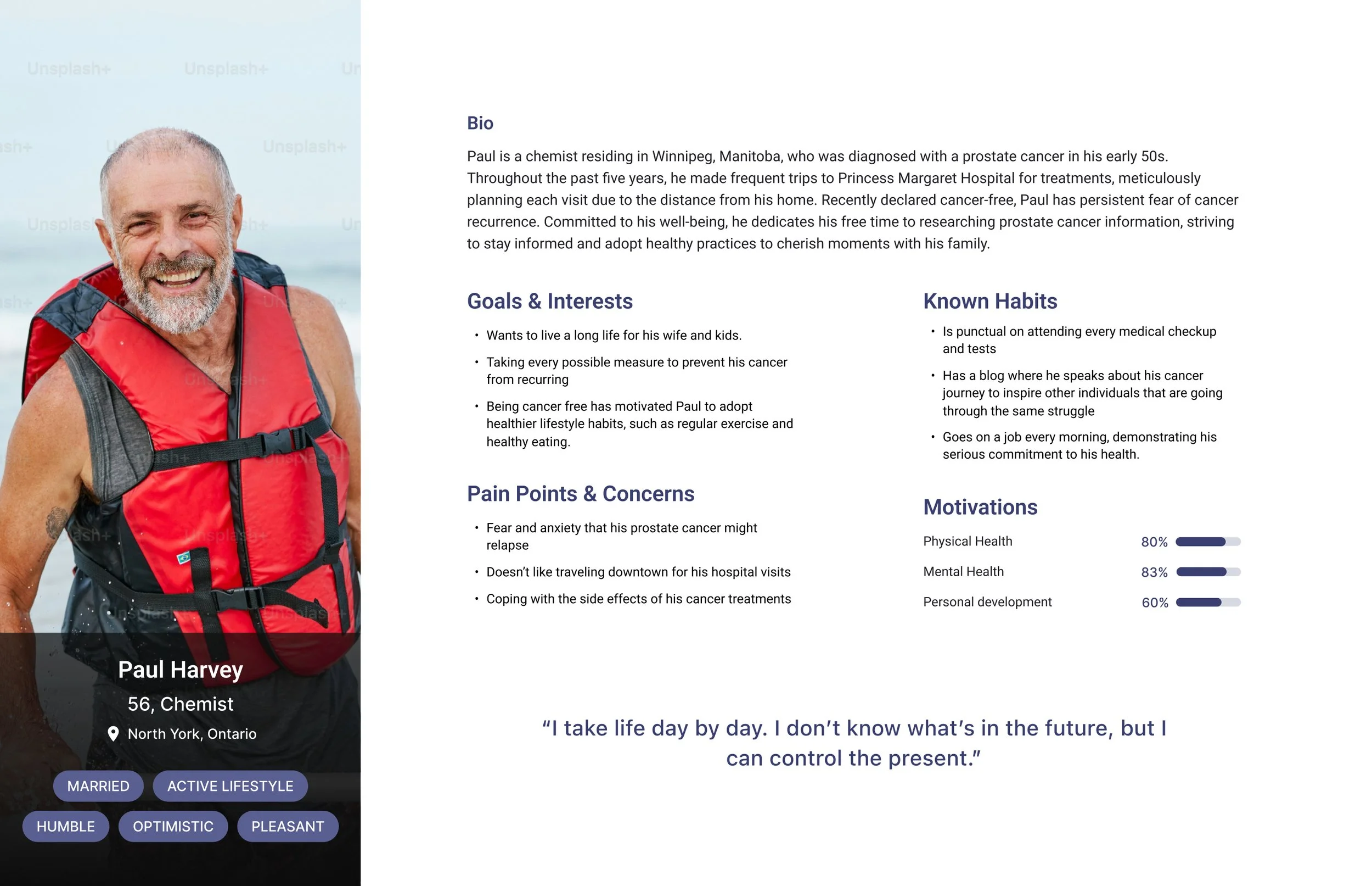
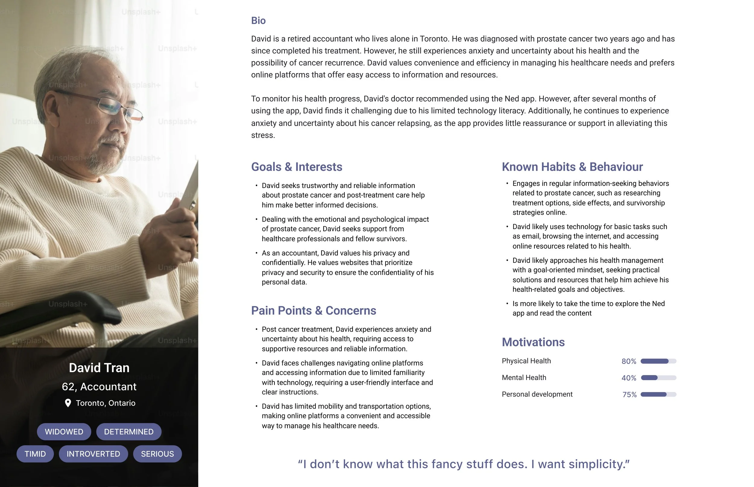
After gathering insights from our user interviews, we used that data to synthesize our user persona to help us empathize with our users.
We want to understand their pre-existing mental models and their goals. From our interviews, I have created 3 personas below to represent our target user group.
-
![]()
Persona: Ken Kekoa
-
![]()
Persona: Paul Harvey
-
![]()
Persona: David Tran
PRELIMINARY USER RESEARCH
One of the pain points mentioned was the information architecture, as it currently has bad usability (the app behaves unexpectedly than what the user expects). User experience is only as strong as the IA. I approached the redesign by empathizing with the user's goals and restructured the content into cohesive categories while prioritizing user needs.

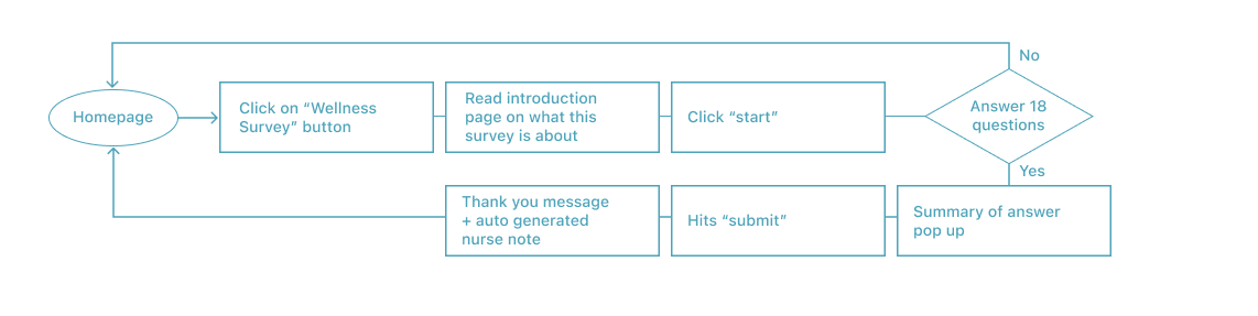
DEFINE: USER FLOW
The following flow shows the steps a user take to submit a wellness survey to a Ned nurse.
CONCEPT SKETCHES LOFI-WIREFRAMING
Since Ned is an existing app, I used its current design as a guide while developing new screens, ensuring we addressed the needs of our users. I focused on improving the copy within the app and adding appropriate feedback where necessary.
SKETCHES


WIREFRAMING
One of the emerging pattern from the user interview revealed that the copy used on the current app was often misleading and behaved unexpected against what users have predicted.
So when i started wire framing I made sure to change the copy to reflecting our user’s health literacy level. This meant simplify the language to make sense to the user and writing in a third person POV. In addition, I closed the feedback loops when conducting after submitting a survey show users that our task is completed.
Targeting the pain points within the wireframes

UI DESIGN : THE GUIDE AND BRANDING
Ned had an existing brand guide, but it lacked a comprehensive design system. Part of my role was to create this design system to ensure consistency across platforms for future designers. User interviews revealed that the existing iconography was unclear. Therefore, I designed new iconography where needed, improving upon the existing ones.
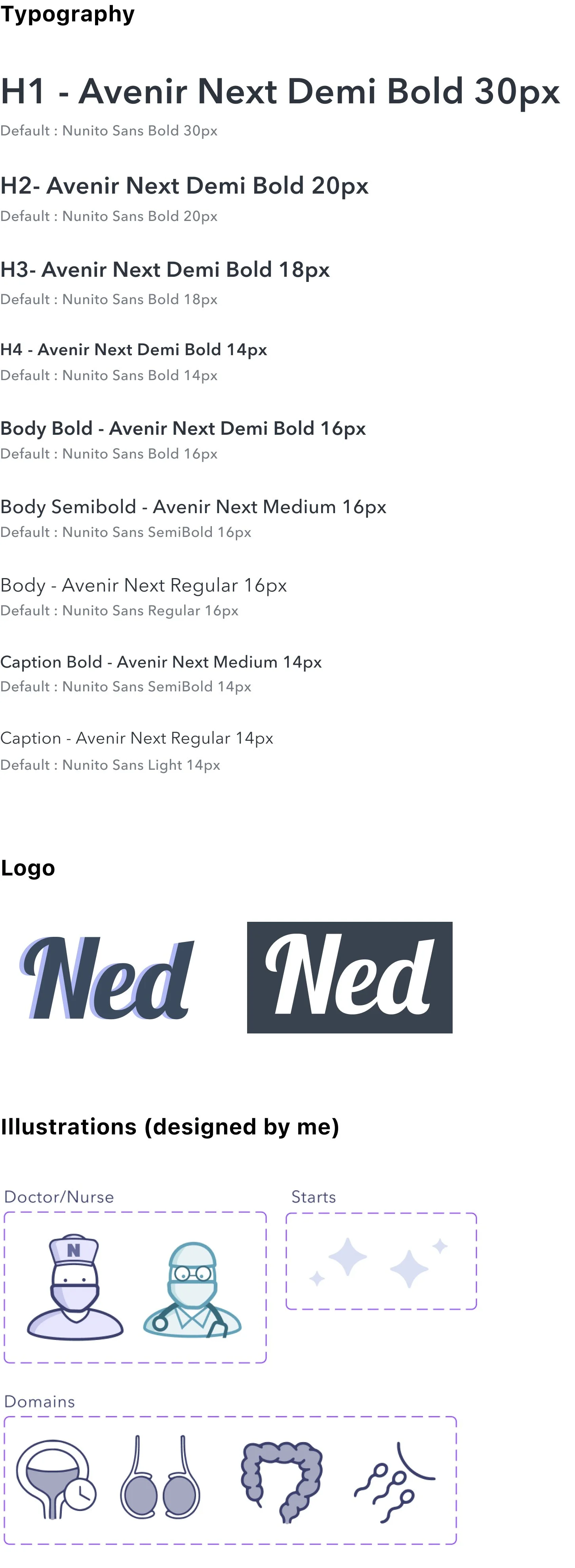
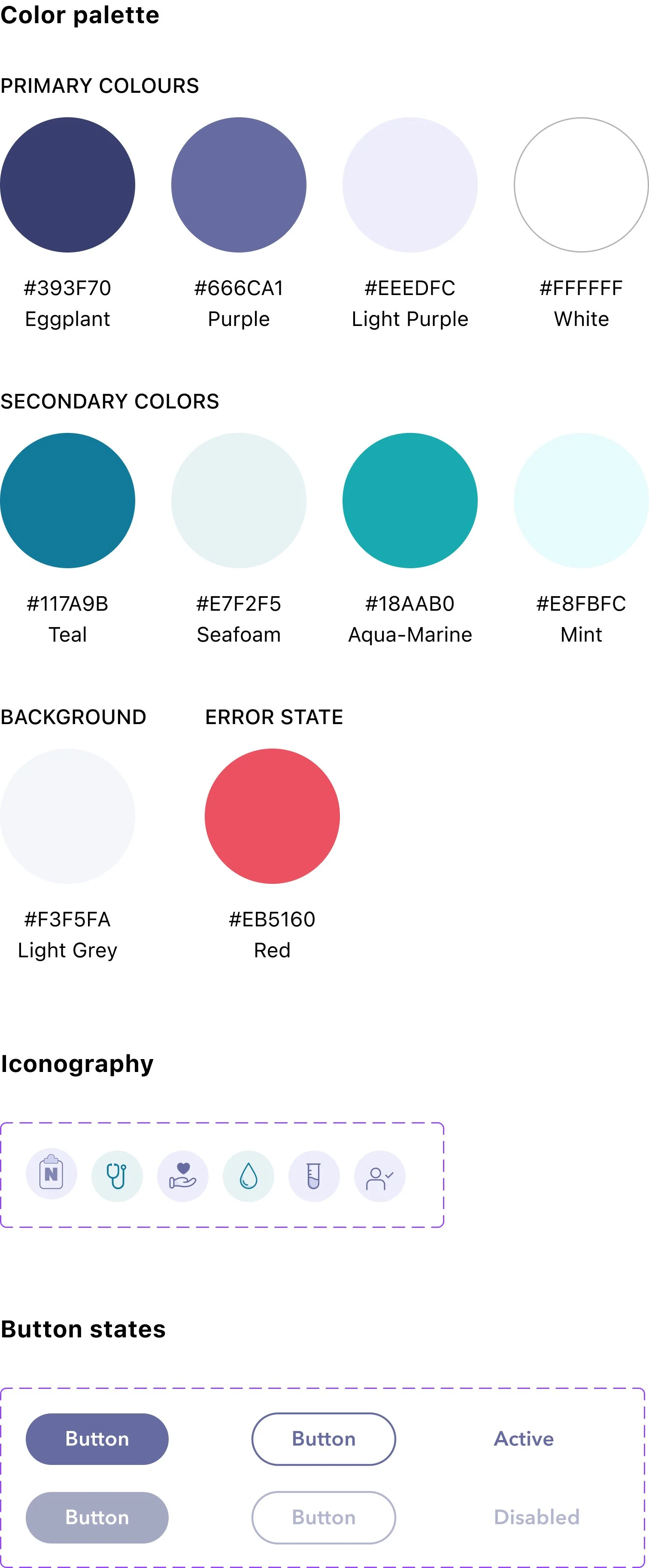
Ned’s existing style guide + design system
FINAL DESIGN
Here are some of the new features and changes made to the original design of Ned taking into our user’s pain points into consideration.
Key moments to highlight in the finalized design
HIGHLIGHTS
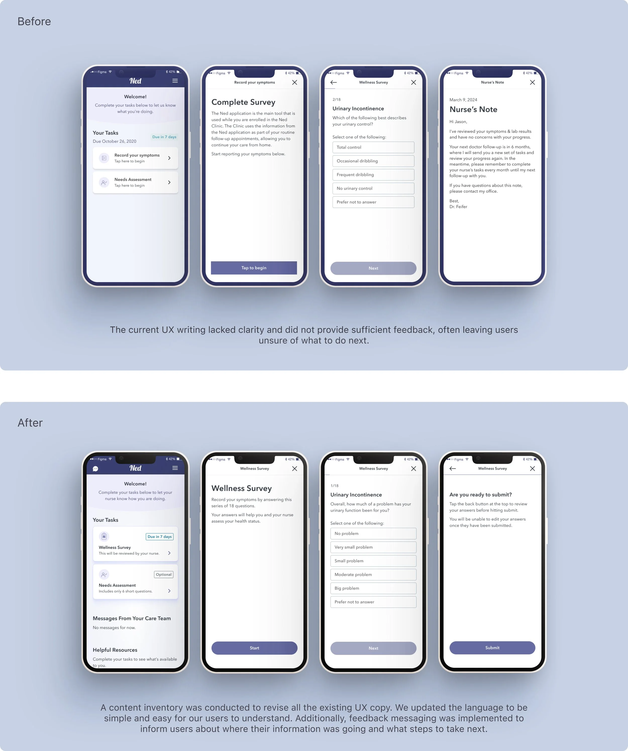
In the previous app design, the UX writing was more clinical and used language understood by clinicians and developers.
In the updated redesign, we updated the language to be more user friendly for the every-day patient who may not have high medical literacy. We also wrote in the active voice, and remember to speak as if we’re a health care professional.
HIGHLIGHTS
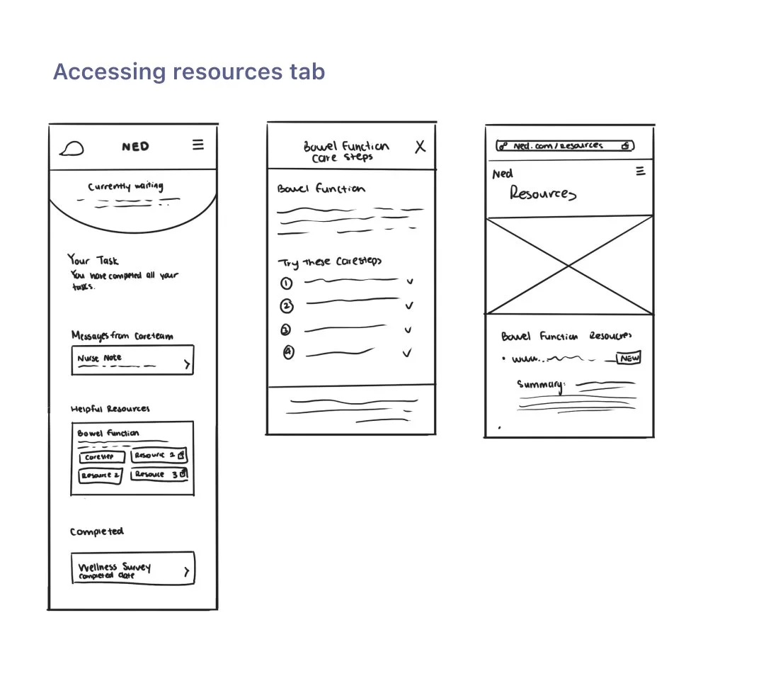
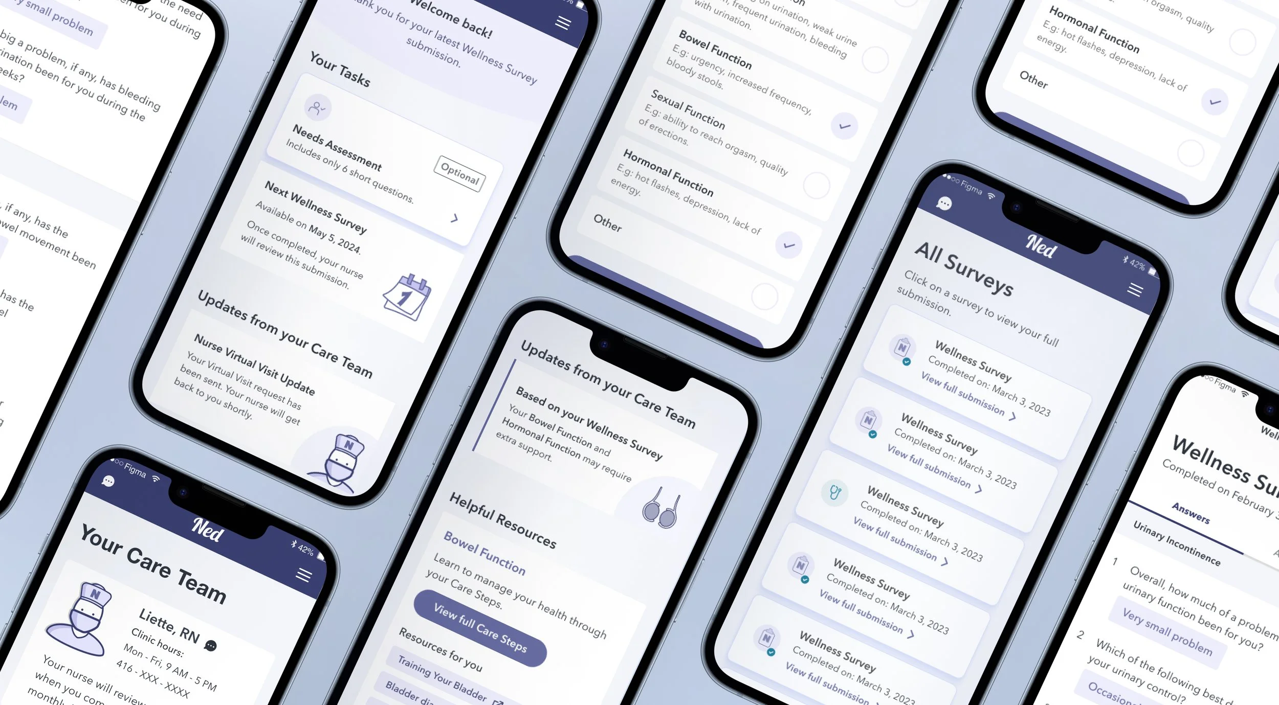
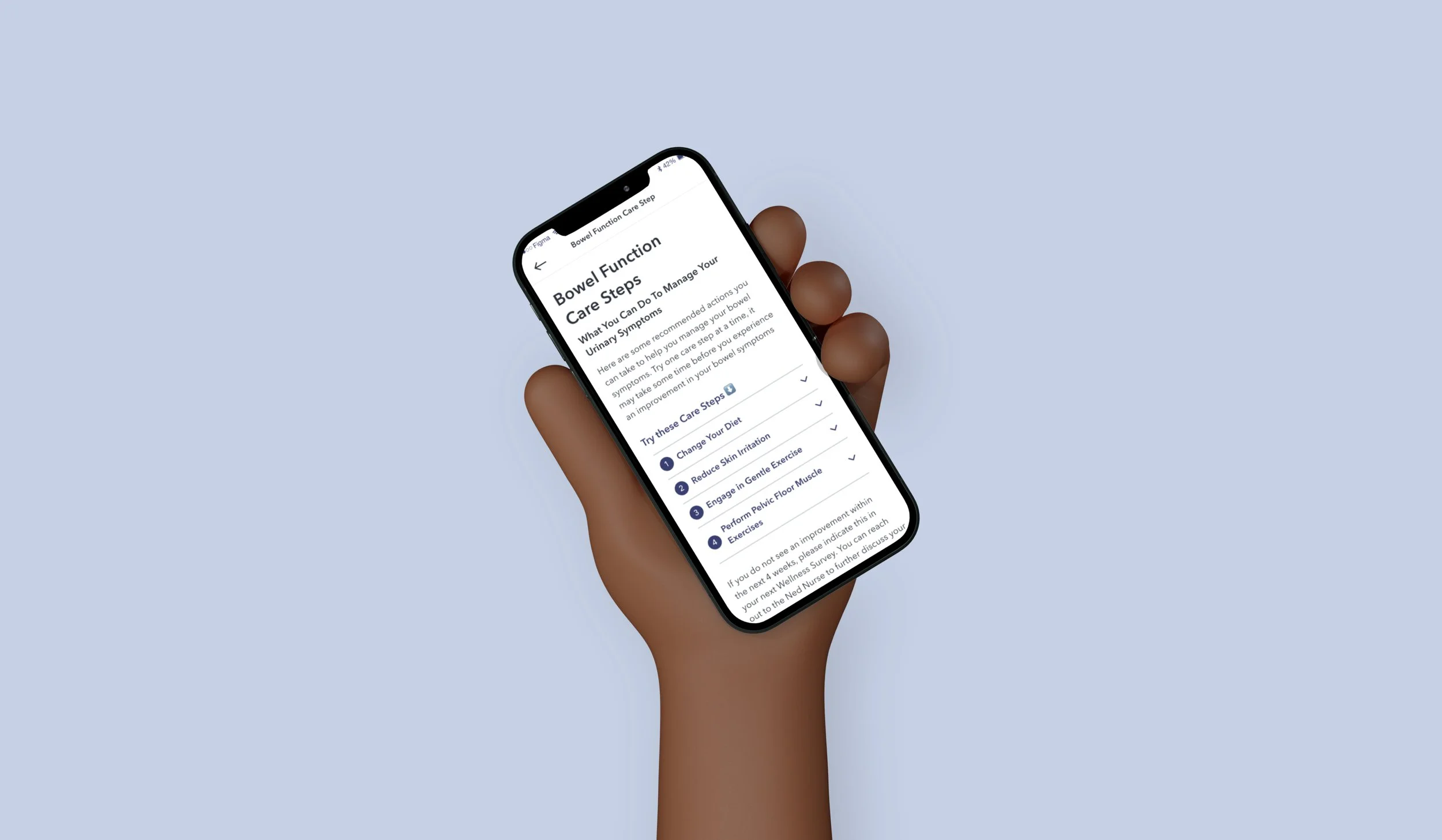
Personalized and trustworthy resources & care steps
There are lots of information regarding prostate cancer on the web, however our users wants reliable sources that we can provide.
User will first complete a Wellness Survey, and whichever domains they flag, we will provide resources for that domain. The goal is to help our user manage that particular domain through resources and care steps.
Human-like and user-friendly voice
HIGHLIGHTS
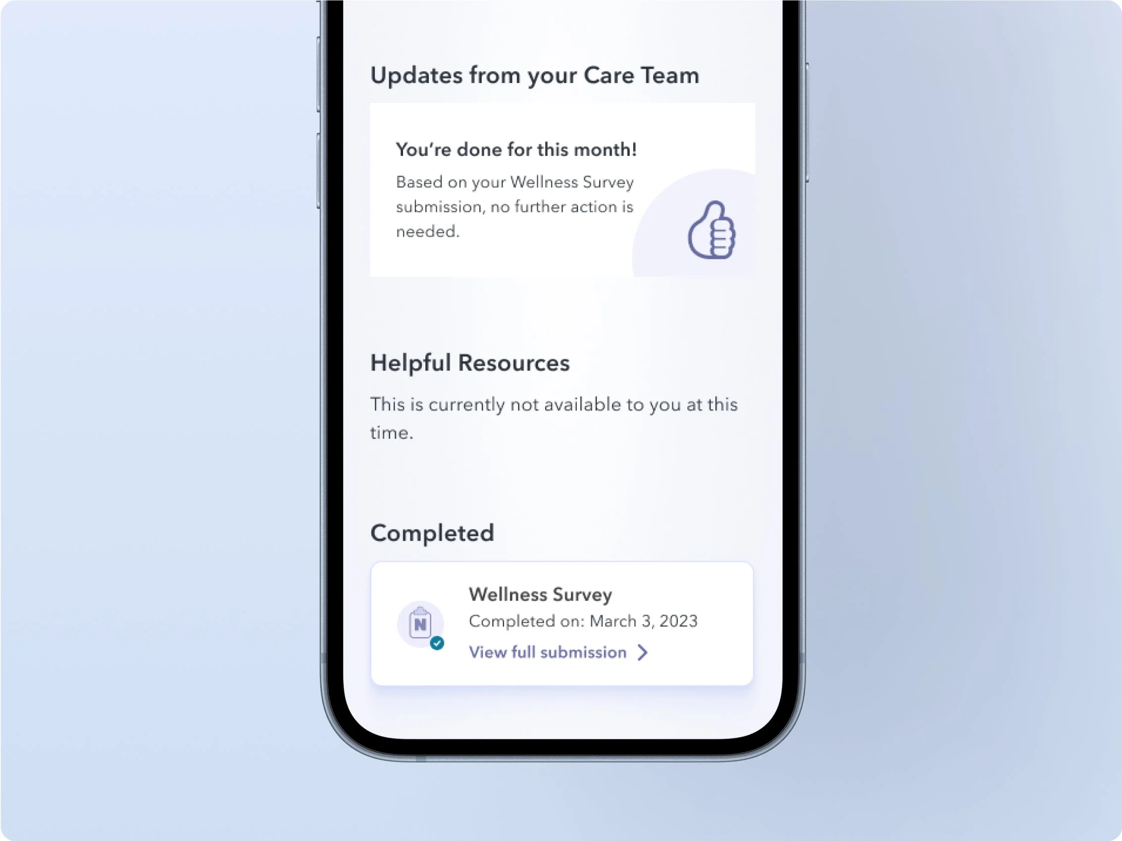
Without proper feedback, users are confused about the status of their information. We included feedback messaging for every task that requires a submission, to show our user what’s happening to their information.
For every action, we need to show an immediate reaction. We need to close the feedback loop as a response to them interacting with the task, thus letting our users know exactly where their information is going.
Appropriate feedback

HIGHLIGHTS
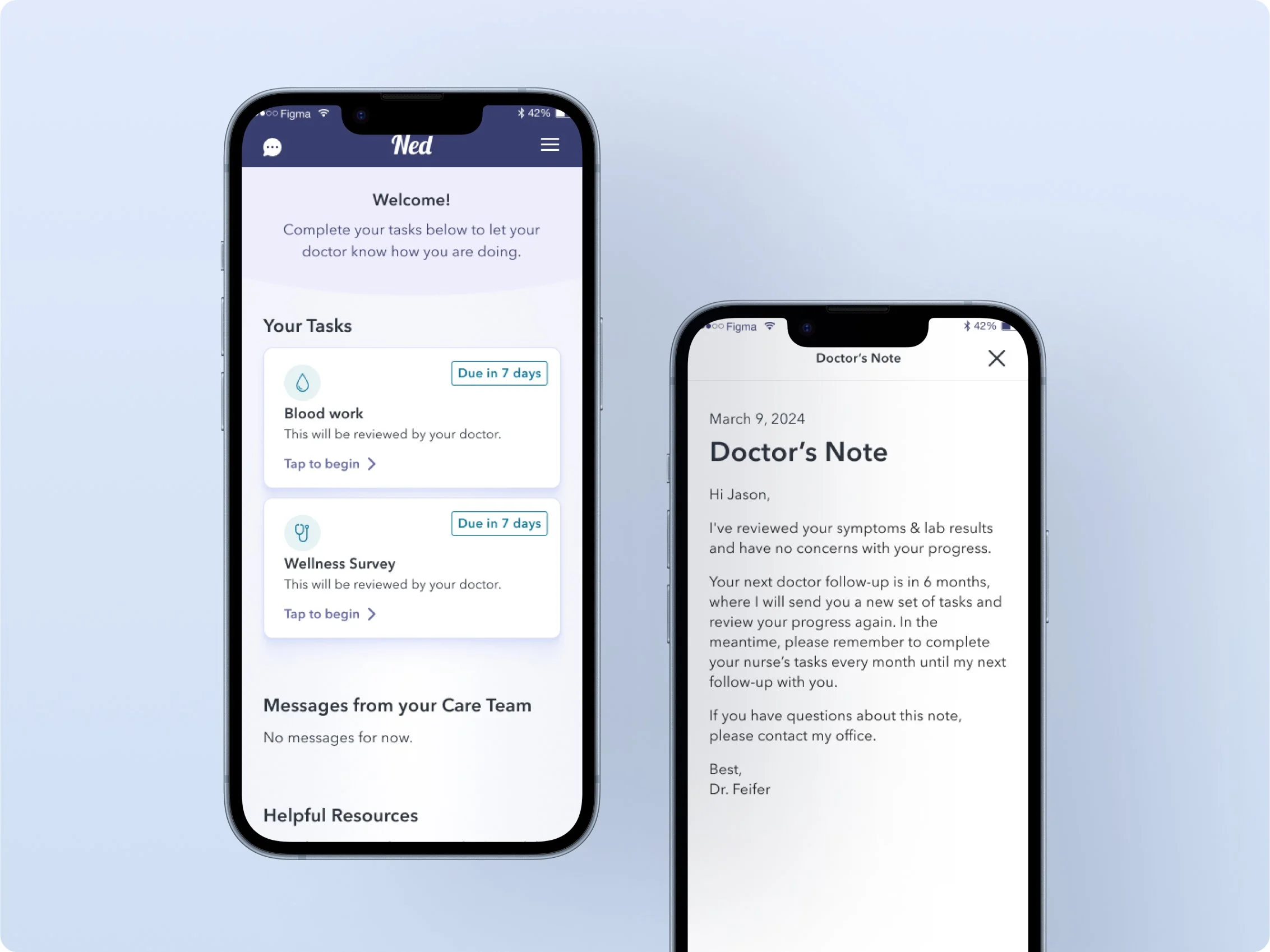
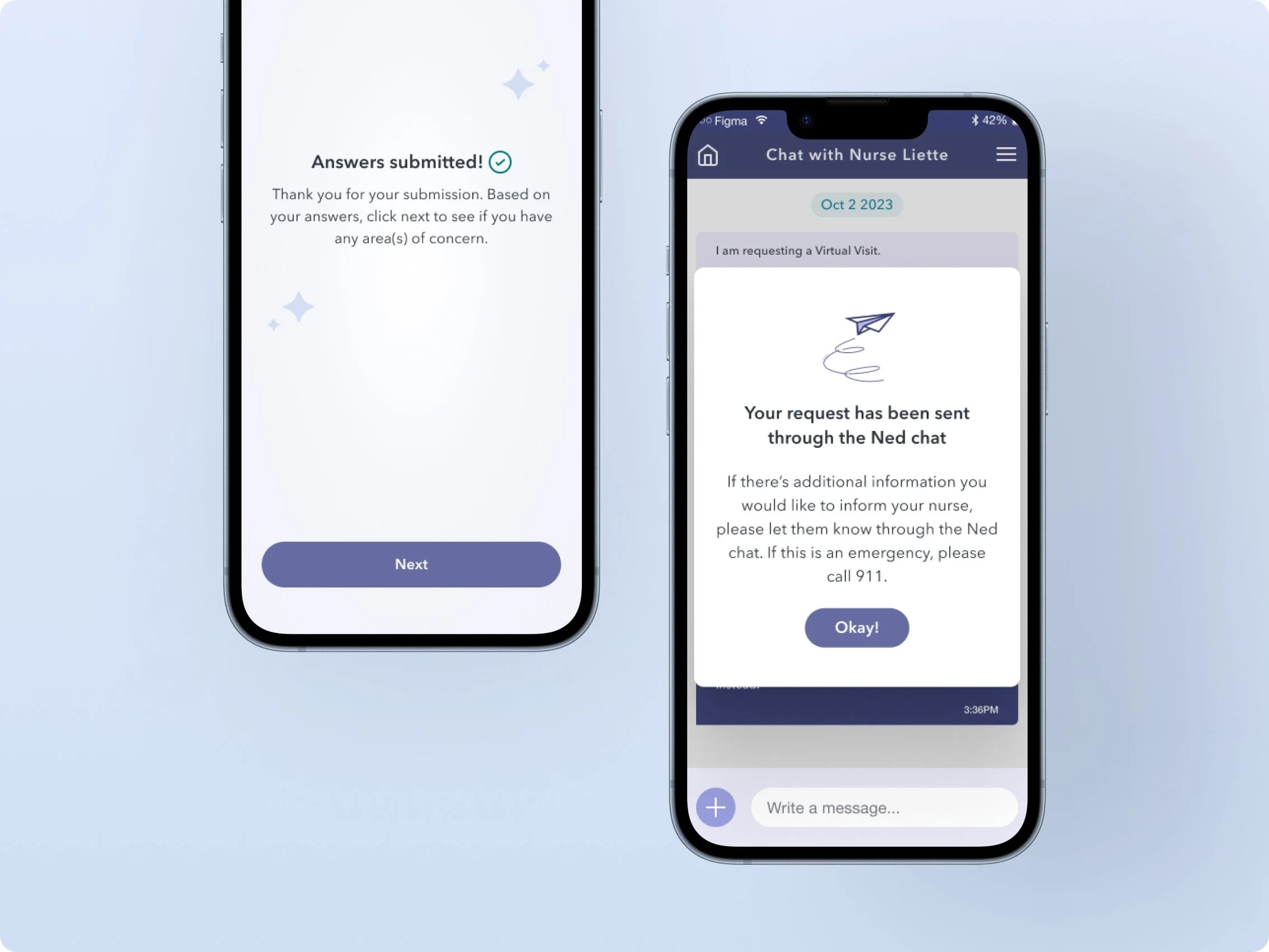
Introducing Nurse Check-ins
One of the major pain points for our users was the delayed feedback from doctors, which discouraged them from using the app.
To address this issue, we introduced a nurse check-in feature, allowing nurses to tend to patients' needs and alleviate the workload of doctors. In addition to adding two nurse tasks, users will also have access to a nurse chat, enabling them to speak with a nurse whenever they need.
HIGHLIGHT ITERATIONS
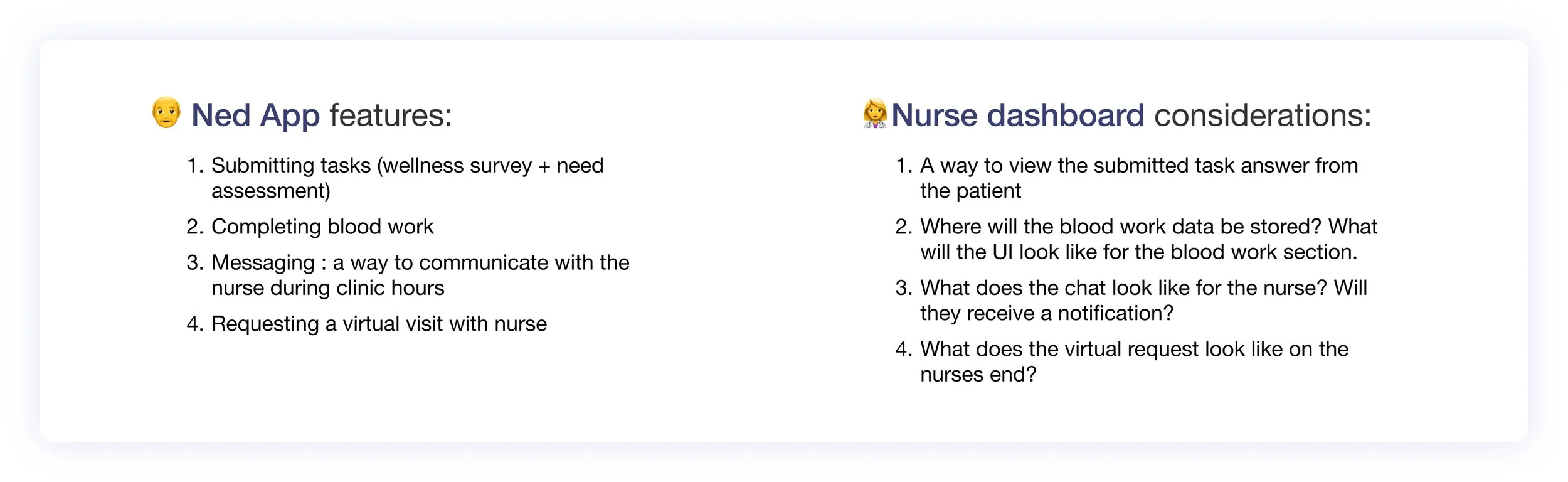
As I was designing the interface for the Ned app (patient-facing app) I wanted to be mindful of what the nurse web app would look like and what features they might want to include.
Here are some brainstorming ideas for the potential nurse dashboard and essential features to include: patient messaging, viewing submitted information, patient notifications, and writing nurse notes.
To effectively address the nurses' UX issues, a deep dive into their workflow will be necessary.
Considerations: Nurse workflow
BEFORE AND AFTER
Mobile screen comparison
HI-FI PROTOTYPE
The final deliverable is a mobile prototype for our client. The primary work flow is to submit a Wellness Survey.
Final Outcomes
KEY LEARNINGS
Interview Actual Users
The key to success in UX design is to actively involve your users throughout the design process because they will be using the product. For the next steps, I would validate my prototype through usability testing and make the iterations accordingly.
🏥
Looking back, these are some of the learning outcomes from this project
🗣
Nurse persona
In the future, I would like to develop a dashboard for the nurses. This redesign introduces a new workflow, which is new for the user (patient) but also the nurse. For future iterations, I would like to design for the nurses and what their needs are to complete their goals.
Make time for feedback
As designers, we all know the importance of usability testing to validate our findings. Due to time constraints, usability testing could not be conducted. Next time, I would plan better and allocate time for testing, as it is a crucial part of the design process.