

GoodLife Fitness Redesign
USER RESEARCH • UX DESIGN • FRONT-END DEVELOPMENT

INTRODUCTION
Goodlife Fitness Centres Inc. is the largest health club company in Canada with over 450 locations across the country, under the banner of four brands. Since the world pandemic of 2019, this has caused a shift in user behaviour revealing that most users plan their workout based on 2 criteria: their work schedule and gym capacity (with a preference for fewer people.) This redesign takes that altered behaviour into consideration by introducing a foot traffic feature.
MY ROLE
User research, synthesize, product design, and style guide.
THE TEAM
2 designers, 1 researcher, 1 developer
TIMELINE
July 2022 - August 2022
BACKSTORY
Goodlife Fitness Centres Inc. is the largest health club company in Canada. With the recent pandemic, members may feel hesitant to go in person to high-volume establishments, including gyms and fitness classes. This redesign addresses that change in behavior by introducing a capacity tracker.

PROBLEM STATEMENT
ACSA’s The Goodlife Fitness website was designed to provide information to users. We have noticed that Goodlife does not provide enough information regarding its gym capacity limit leading users to seek the information elsewhere, causing an overall poor user experience. How might improve Goodlife so that users are well informed leading to a more positive user experience and return visits to the website?
SOLUTION
A redesign of the current website with a new feature based on user behaviours. We believe a foot traffic feature will result in a better user experience and increase gym visits, longer workouts, and customer retention.
DEFINE
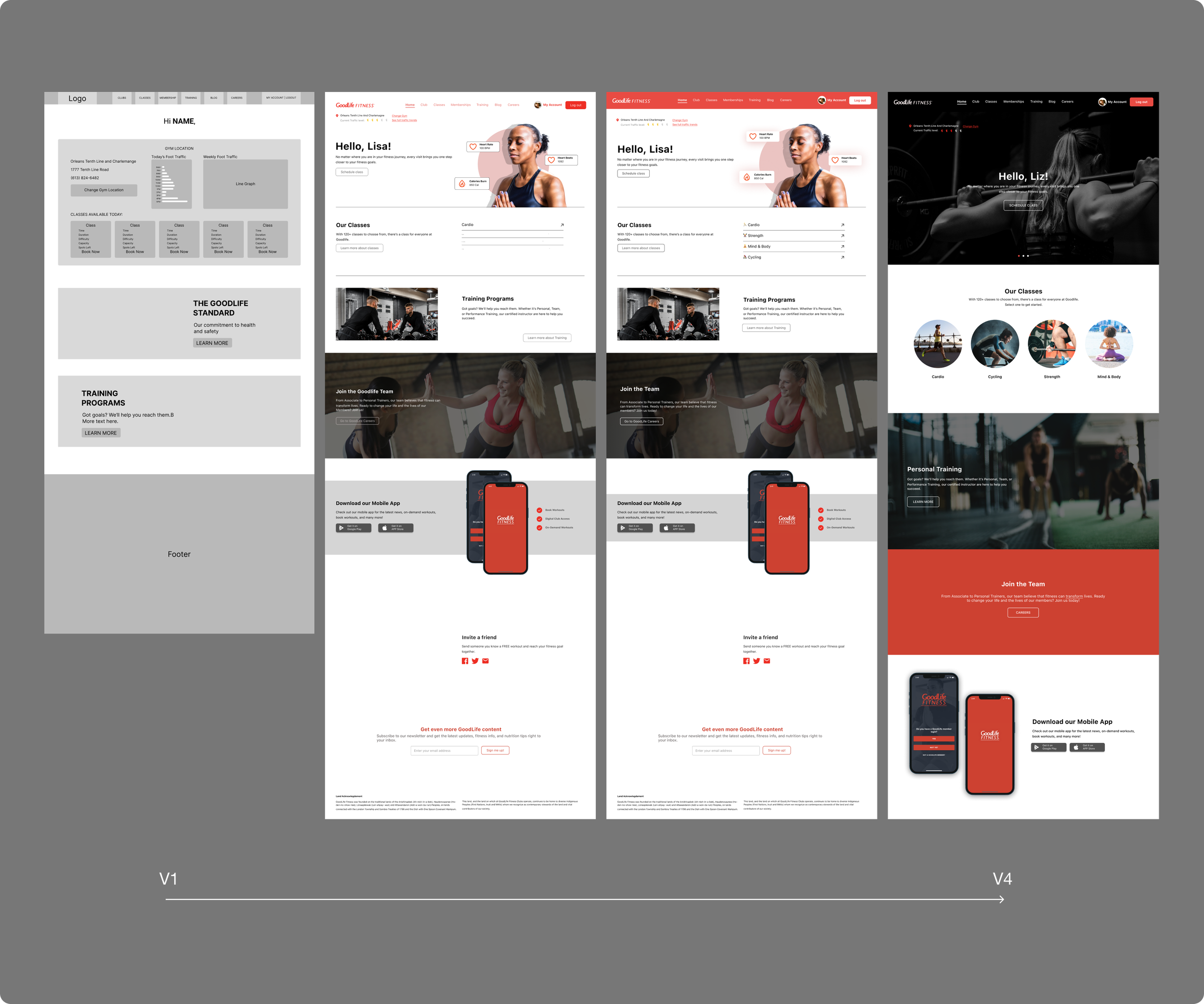
Currently, the website has a decent UI. But more white space is needed to help give breathing room for users. Some of the design choices are also outdated.
More user testing needs to be run to determine the current UX and where improvements can be made.
The project kickoff started with a visual analysis of the current website.
KEY TAKE AWAYS

PRELIMINARY USER RESEARCH
My objective was to uncover the pain points and motivation of our users. Additionally, I hope to find common themes relating to the problem space.
I conducted 8 semi-structured interviews in-person with participants who actively attend the gym in order to uncover the pain points of the current website.
The criteria to participate is that they must self-identify as a “gym rat” or “gym-goer” — This is a term often used to describe someone who is dedicated to their workouts and spends a lot of time at the gym.
Let’s dive into research.
KEY TAKE AWAYS
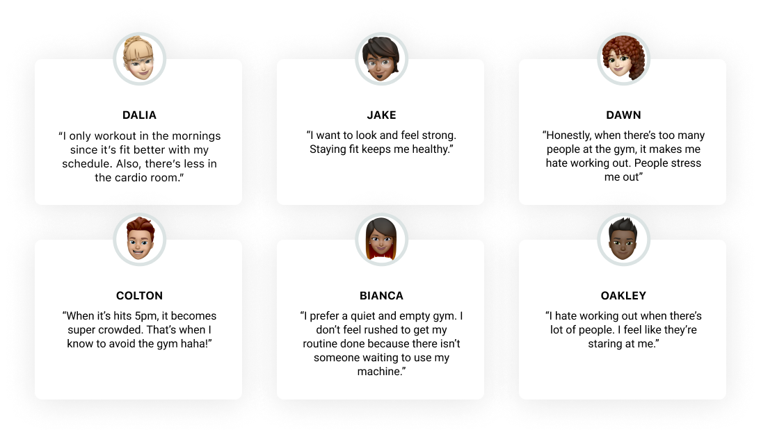
EMERGING THEME FROM RESEARCH
Crowded gyms impact workout performance, reinforce negative feelings and hinder focus. When given the choice, users would prefer to work out in a less-busy gym rather than peak hours.
⏰ Scheduling based on capacity
Users would choose to workout early in the morning or late evening to avoid large crowds.
🤸Preference for less people
USER RESEARCH
Since the fitness space is quite saturated, we wanted to explore what was currently in the market. We used a 2x2 matrix to map out solutions offered by our competitors compared to our idea. Since none of our competition offered a capacity-tracking feature, we knew our idea was unique to the market.
Competitor Analysis

SOLUTION
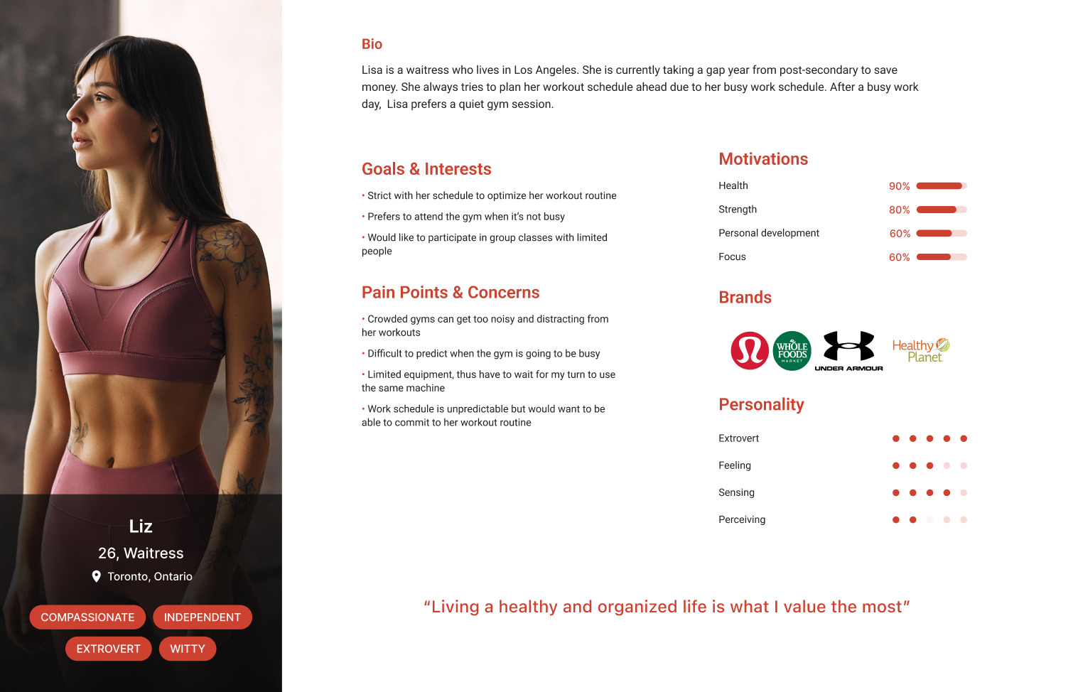
User Persona
After gathering insights from our user interviews, we used that data to synthesize our persona to help us empathize with our users.
How might improve Good life so that users are well informed leading to a more positive user experience and return visits to the website?
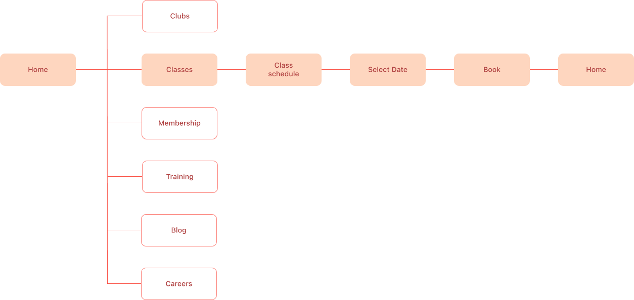
USERFLOW
After defining the problem space, I then visualized the user flow by creating a chart. Since redesigning a whole web page would be impossible within 3 weeks, I focused on redesigning our user flow for users enrolling into programs.
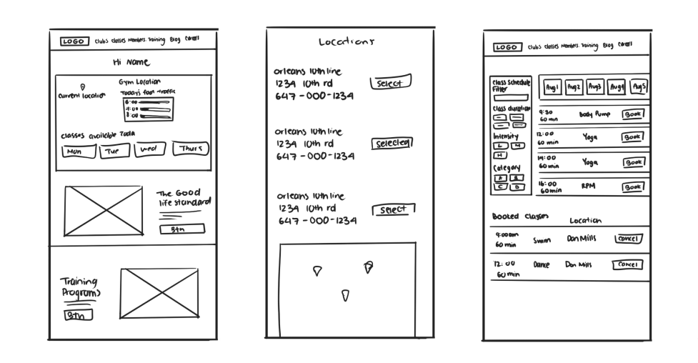
CONCEPT SKETCHES
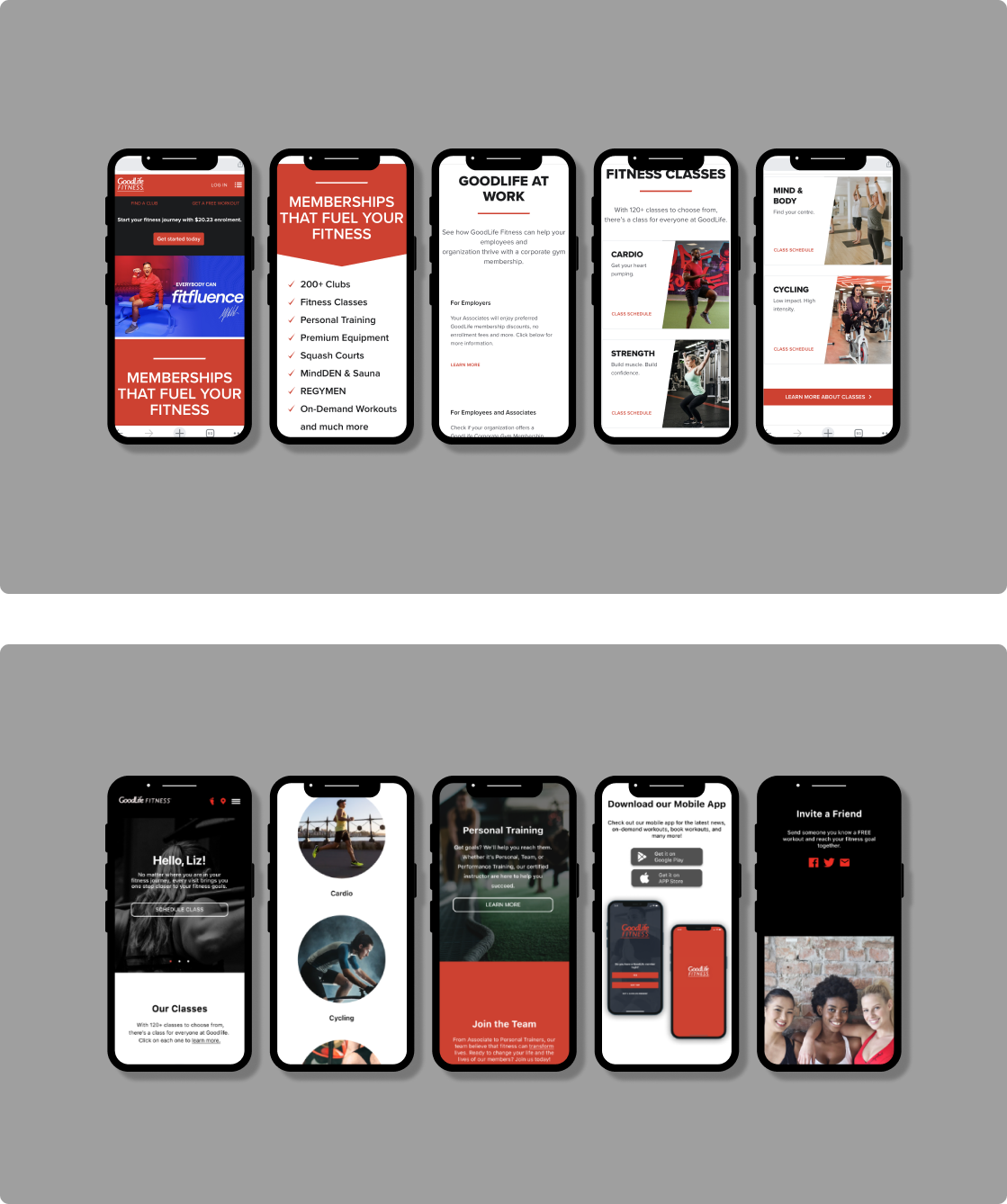
The purpose of having a lo-fi prototype was to start testing ASAP to identify any issues with the primary flow. Following the user-flow as a guide, I created some wireframes on what our redesign could look like.
Using the user-flow as a guide, I created wireframes on potential designs
VISUAL IDENTITY
In order to maintain consistency with our brand and improve the user interface of GoodLife's redesign, it is important to have a style guide. During the brainstorming process, we identified some terms that accurately reflect the visual identity of GoodLife.
To make our work easier, we put together a style guide


Using this list, I put together a moodboard
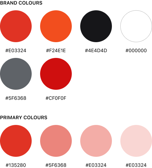
COLOUR & TYPOGRAPHY
Color invokes certain moods and emotions, so choosing the right colors is important to any brand identity. Using a style guide keeps components consistent and professional.
To keep the sense of familiarity, I decided to stick with the same Conor palette as before.
As for typography, I used SF Pro for a clean look and feel. Inspired by Apple fonts.

USER TESTING
Guerrilla testing was conducted the lo-fi prototype to test the overall experience through my design
USER TESTING
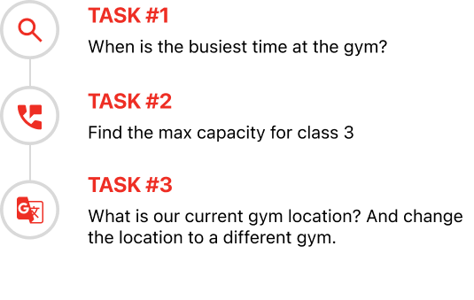
Imagine you are a fitness junkie who loves going to the gym, but because of your new job, you have to adapt to an inconsistent schedule. How might you go about completing this task?
DEMOGRAPHICS
Interviewees are typical gym-goers, aged 26-50. I conducted 5 user tests.
RESULTS FROM USER TESTING
📱 Most task were completed with no issue
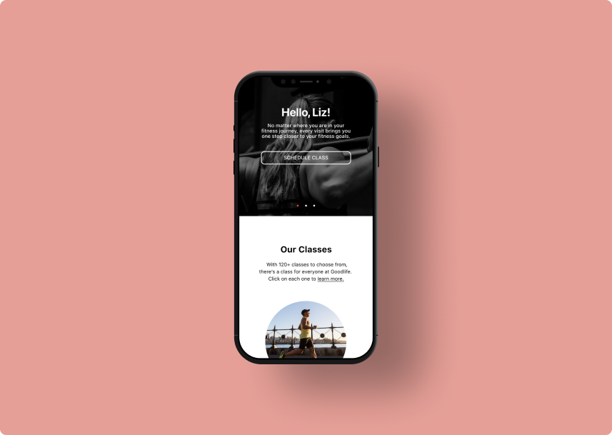
The success rate for all the tasks was ~96%. The majority of the information was easy to locate. Most users were able to navigate through the desired information with ease. The downfall of the perfect score was due to the complexity presented on the foot tracker. Our conclusion is that we needed to simplify the foot traffic feature to make it more intuitive.
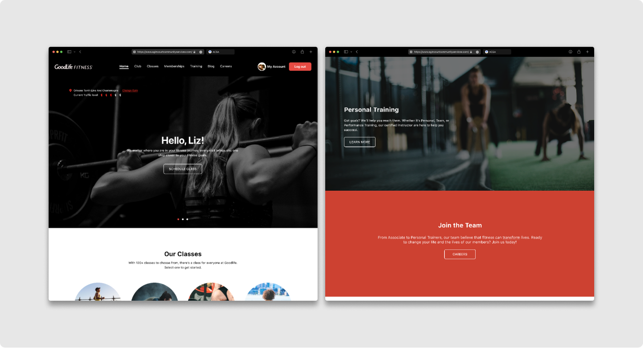
FINAL DESIGN
Here are some highlights we implemented based on user testing feedback.
After making some iterations based on user testing, so I moved on to hi-fi prototyping
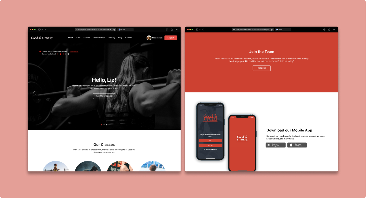
HIGHLIGHTS
During the first round of user testing, we found our original foot tracker design was confusing for users because it provided more info than needed. Thus, we opted for a simplified layout that conveyed our message using icons rather than complex charts.
Simplify the foot traffic feature
HIGHLIGHTS
It’s a digital age where everyone is on their mobile devices. So making sure webpages are responsive should be the bare minimum.
Responsiveness

To improve user experience, we switched to a darker color scheme from the previous red color, as it was found that a majority of users were visiting the website during early morning or late night hours, which can cause strain on the eyes.
Darkmode Preference
ITERATIONS
The double-diamond model is a very iterative process with lots of back and forth. Here are some drafts showing the design progress made via user testing and feedback.
Since homepage is the first page our users will land on our website, we spent a considerable amount on it. Here are all the iterations we’ve made. We ultimately decide to focus more on visuals > text.
I went through many iterations of the homepage before settling with the final design (for now)
MORE ITERATIONS
Mobile screen comparison (V1 & Final)
HI-FI PROTOTYPE
After completing a mid-fi prototype, wireframe, and iterations, I was able to produce a high-fidelity prototype. The primary task flow is looking up information on the afterschool programs for children.
Final Outcomes

KEY TAKEAWAYS
🥼Feasibility of the feature
Upon reflection, it seems that this feature may not be as useful as we had initially thought. In order to determine its effectiveness, I plan to conduct additional user testing. While the idea behind the feature may be sound, it is important to consider whether or not it will actually be used by our users
Looking back, these are some of the learning outcomes from this project
🧐 Confirmation Bias
It is possible that our personal experiences as active gym-goers may have influenced our initial research on the topic. This may have led to confirmation bias, where we looked for information that supported our preexisting beliefs. In order to ensure the validity of our research, it is important that we let the data guide our conclusions rather than seeking out data that confirms our biases.